CONTENT
Working with data in tableau
Master Tableau techniques for working with extracted and live data, filtering, joins, and blends to enhance performance and real-time insights for strategic planning.


Saartje Ly
Data Engineering Intern
Introduction
Learning how to work with extracted and live data, filtering, joins, and blends in Tableau is crucial for performance, real-time insights, automatic updates, complex relationships, combining multiple data sources, strategic planning and more.
Open your Tableau App and open the Superstore Sample Workbook down the bottom.

Make sure you are in the Data Source tab down the bottom left.
Sample Superstore Data Source view - Extracted Data
You should be able to see your data sheets to the left, and selected data down the bottom.
Splitting Columns
Let’s say you had a column of Names. A very useful tip is clicking the down arrow on a column and choosing ‘Split’. This would split the column into two - one for first names and one for last names. The delimiter it uses is a space.

After a split you can rename the columns by double clicking on the header.
Filtering
We are now going to add a filter on the date - we only want to see a specific date range of data.
Change your connection from Live to Extract, then click Edit.

Click Edit under Filters

Add the Filter Order Date.

Select the filter Range of Dates

The start of our data is 3/01/2021. We want to change this range below to end on 12/31/2021. Click OK when done.
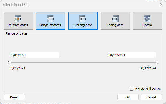
Save this setting.
You can also add filters with the Add button. This filters the data source rather than the extract. An extract is static data based on a criteria you select.
Make sure to save your file. When you save, it’ll ask if you want to extract your data. Click yes. After, you should see this message.
You’ll notice that there is a Refresh button available. When the original source data gets updated, you’ll need to refresh to get this data in your extracted data source.
Sample Superstore Sheet view - Extracted Data
Click the first plus button down the bottom left to create a new sheet.
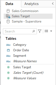
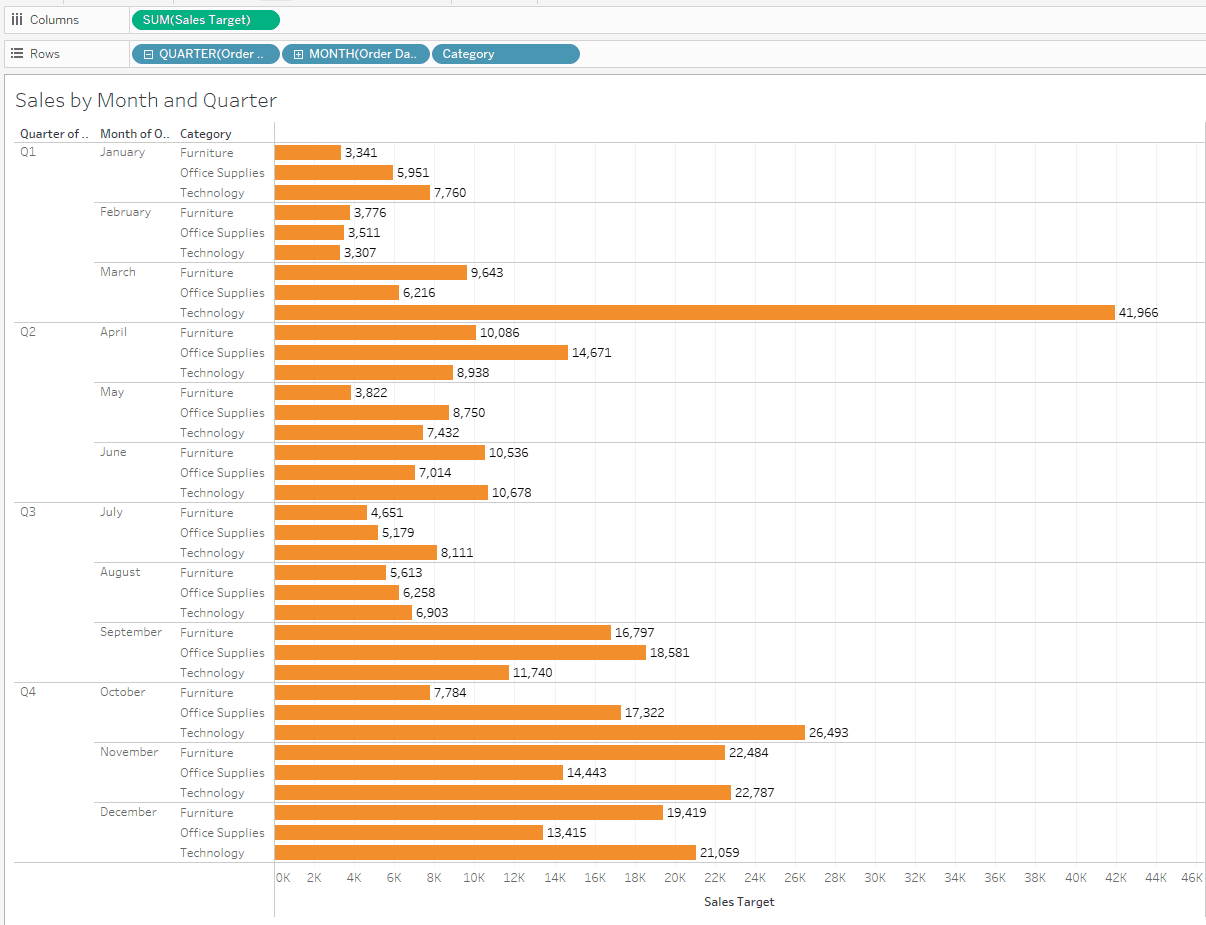
On the left hand side you’ll notice a Data sidebar. Double click on Order Date under tables.
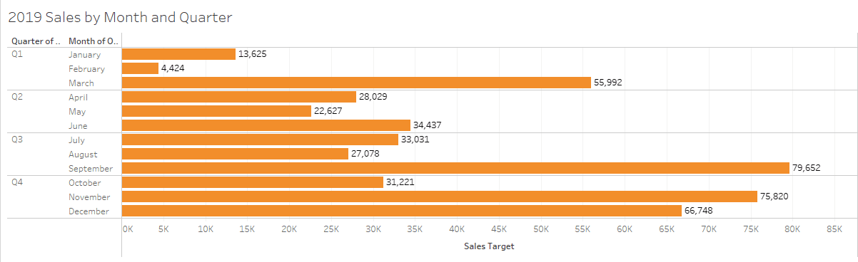
The Order Date is automatically added to the Columns shelf with the value Year. We want the month, so what we’ll do is hover over this data box, click the down arrow, and select month.
Click and drag Order Date into the Rows shelf again, and change the type to Quarter.
Click and drag Sales Target to the Column shelf.

In the top right, the Show Me pane should be open, showing all the visualizations available.

Click on the horizontal bars plot.
On the Marks card to the left you can change various things about your plot. Open Color and change to orange.
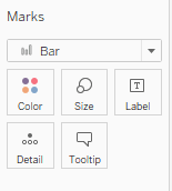
Click on Label, and tick ‘Show mark labels’.
You can change the name of the sheet at the bottom by double clicking on the sheet box.
If you name the sheet, it automatically names the title; however we can name the title something different without impacting the sheet name. You may do this by double clicking on the sheet title.
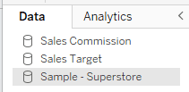
We are now going to create a new Tableau workbook. This current sample workbook is only using extracted data, but we want to access all the data.
Click this icon in the top left corner to head back to the start page.
Filtering with Sample Superstore in Data Source view - Live Data
Click on the Sample Superstore Workbook again and go to the Data Source tab at the bottom.
Leave the data as Live.
Let’s navigate to a new sheet again, as we are going to recreate what we made with the extracted data - but now with all the data.
1. Click and drag Order Date to the Rows shelf and change the type from Year to Month
2. Click and drag Order Date to the Rows shelf again and change the type from Year to Quarter
3. Click and drag Sales Target to the Columns shelf
4. Expand the Show Me button, and choose the horizontal bar chart
5. From the Marks card change the colour to orange, and turn the Labels on
6. Rename the sheet to ‘Sales by Month and Quarter’
Head to Data Source view.
We are now going to filter using the Add button. Click this button.
Add a filter for Segment, and tick Home office. Click OK.
This only keeps data for the Home office Segment.
When we head back to our Sales by Month and Quarter sheet, our chart has adjusted because it’s only showing us information for the Home office segment.

You can add another field to the Row shelf to view by. Below I'm viewing by Category.
We are now going to create a new sheet.
Making sure you’re using the Sample - Superstore Data, drag Customer Name to the Rows shelf.
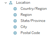
Drag and drop State/Province into the Rows shelf.
Drag Orders(Count) to Columns.
Here we have a count of orders by name broken down by states.

To filter by state, click the dropdown arrow in the State/Province box and click Filter.
Select None, then choose which states you’d like to filter by.

Now, remove Customer name. Click on the arrow dropdown for State/Province again, click ‘Edit Filter’, select ‘All’ and Apply. Now, click the dropdown arrow again for State/Province but this time select ‘Show Filter’.
On the right side of the screen you get a filter panel.

Joins with Sample Superstore
At some point in your Tableau career you’ll need to know how to join two tables. Below is an explanation of what each join type does.
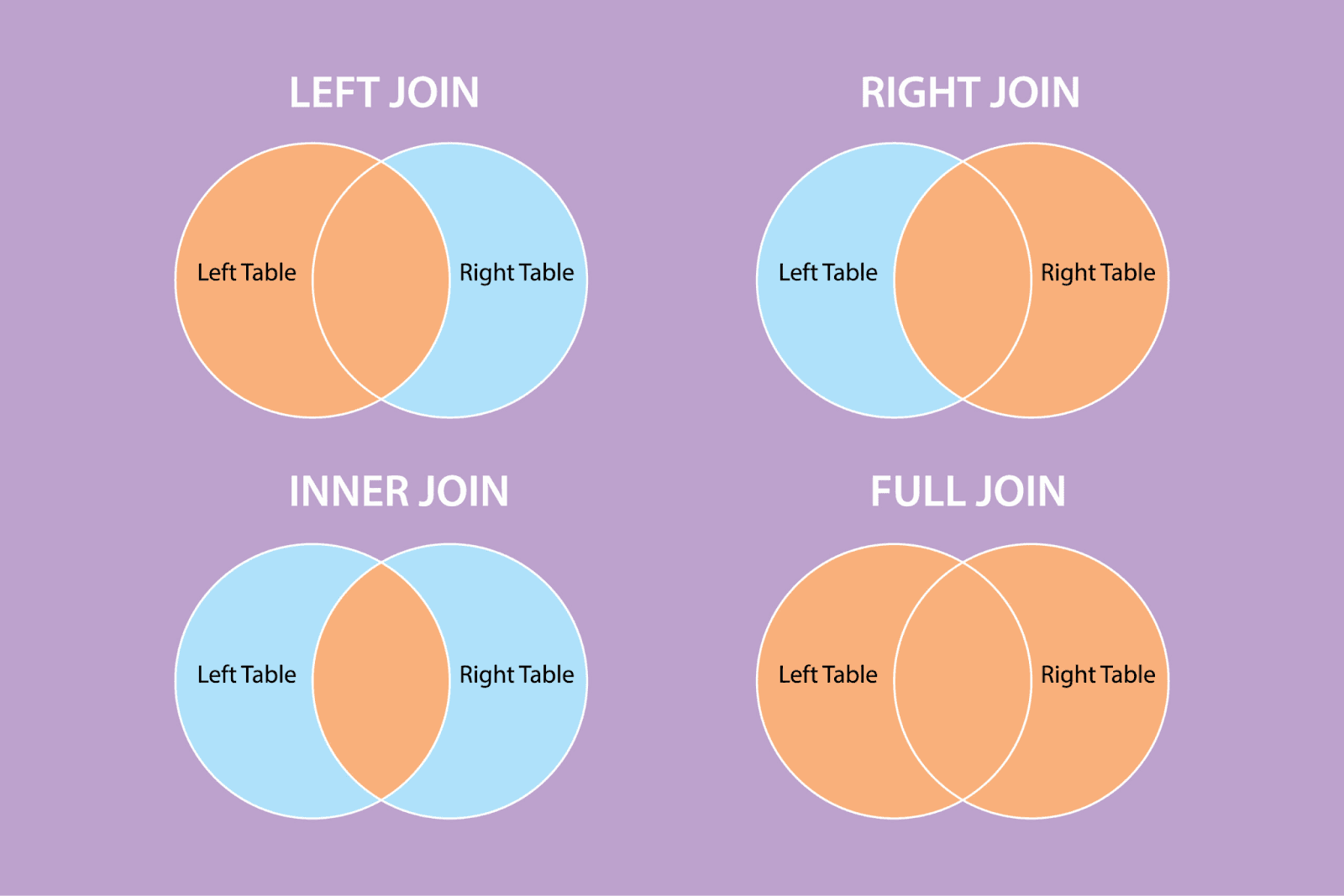
Left join - The resulting table contains all the records from the left table and only matching records from the right table. If there are no matches in the right table, null values will be shown in the data grid.
Right join - The resulting table contains all the records from the right table and only matching records from the left table. If there are no matches in the left table, null values will be shown in the data grid.
Inner join - Only the common matching data between two tables is displayed.
Full join - Data from both tables are merged and displayed. The values that are not matching in both tables are shown as null values.
In Data Source, double click on the Orders box.
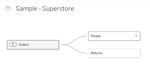
Drag and drop another table into the canvas.

Here we have joined two tables, you can select the type of join you’d like to do. Drag and drop as many tables as you’d like to join onto the canvas.

Blending with Excel CSV files
In Tableau, blending and joining tables are two different methods used to combine data from multiple sources.
I will now demonstrate how to blend using two Excel CSV files.
An Excel CSV file is the same as a Text file in Tableau.
Under To a File in the start page, click Text file and add in your first data source.
To add the next data source, click on the cylinder dropdown and click ‘New Data Source’.

Select Text file again, and select your next data source.
To switch between the two sources, you can click on the cylinder dropdown.
Navigate to Sheet1 on the bottom left hand corner.
In the sidebar to the left you’ll notice your data. Drag and drop some data into the Rows shelf.

Drag and drop data into the Abc column on the sheet. For example I could drop Payment Value to view the payment value of each Order Id.

You’ll notice one of the tables has a blue check mark next to it. This signifies that it is the primary table in the blend. The orange check mark tells us the table is a secondary data source.
Introduction
Learning how to work with extracted and live data, filtering, joins, and blends in Tableau is crucial for performance, real-time insights, automatic updates, complex relationships, combining multiple data sources, strategic planning and more.
Open your Tableau App and open the Superstore Sample Workbook down the bottom.
Make sure you are in the Data Source tab down the bottom left.
Sample Superstore Data Source view - Extracted Data
You should be able to see your data sheets to the left, and selected data down the bottom.
Splitting Columns
Let’s say you had a column of Names. A very useful tip is clicking the down arrow on a column and choosing ‘Split’. This would split the column into two - one for first names and one for last names. The delimiter it uses is a space.
After a split you can rename the columns by double clicking on the header.
Filtering
We are now going to add a filter on the date - we only want to see a specific date range of data.
Change your connection from Live to Extract, then click Edit.
Click Edit under Filters
Add the Filter Order Date.
Select the filter Range of Dates
The start of our data is 3/01/2021. We want to change this range below to end on 12/31/2021. Click OK when done.
Save this setting.
You can also add filters with the Add button. This filters the data source rather than the extract. An extract is static data based on a criteria you select.
Make sure to save your file. When you save, it’ll ask if you want to extract your data. Click yes. After, you should see this message.
You’ll notice that there is a Refresh button available. When the original source data gets updated, you’ll need to refresh to get this data in your extracted data source.
Sample Superstore Sheet view - Extracted Data
Click the first plus button down the bottom left to create a new sheet.
On the left hand side you’ll notice a Data sidebar. Double click on Order Date under tables.
The Order Date is automatically added to the Columns shelf with the value Year. We want the month, so what we’ll do is hover over this data box, click the down arrow, and select month.
Click and drag Order Date into the Rows shelf again, and change the type to Quarter.
Click and drag Sales Target to the Column shelf.
In the top right, the Show Me pane should be open, showing all the visualizations available.
Click on the horizontal bars plot.
On the Marks card to the left you can change various things about your plot. Open Color and change to orange.
Click on Label, and tick ‘Show mark labels’.
You can change the name of the sheet at the bottom by double clicking on the sheet box.
If you name the sheet, it automatically names the title; however we can name the title something different without impacting the sheet name. You may do this by double clicking on the sheet title.
We are now going to create a new Tableau workbook. This current sample workbook is only using extracted data, but we want to access all the data.
Click this icon in the top left corner to head back to the start page.
Filtering with Sample Superstore in Data Source view - Live Data
Click on the Sample Superstore Workbook again and go to the Data Source tab at the bottom.
Leave the data as Live.
Let’s navigate to a new sheet again, as we are going to recreate what we made with the extracted data - but now with all the data.
1. Click and drag Order Date to the Rows shelf and change the type from Year to Month
2. Click and drag Order Date to the Rows shelf again and change the type from Year to Quarter
3. Click and drag Sales Target to the Columns shelf
4. Expand the Show Me button, and choose the horizontal bar chart
5. From the Marks card change the colour to orange, and turn the Labels on
6. Rename the sheet to ‘Sales by Month and Quarter’
Head to Data Source view.
We are now going to filter using the Add button. Click this button.
Add a filter for Segment, and tick Home office. Click OK.
This only keeps data for the Home office Segment.
When we head back to our Sales by Month and Quarter sheet, our chart has adjusted because it’s only showing us information for the Home office segment.
You can add another field to the Row shelf to view by. Below I'm viewing by Category.
We are now going to create a new sheet.
Making sure you’re using the Sample - Superstore Data, drag Customer Name to the Rows shelf.
Drag and drop State/Province into the Rows shelf.
Drag Orders(Count) to Columns.
Here we have a count of orders by name broken down by states.
To filter by state, click the dropdown arrow in the State/Province box and click Filter.
Select None, then choose which states you’d like to filter by.
Now, remove Customer name. Click on the arrow dropdown for State/Province again, click ‘Edit Filter’, select ‘All’ and Apply. Now, click the dropdown arrow again for State/Province but this time select ‘Show Filter’.
On the right side of the screen you get a filter panel.
Joins with Sample Superstore
At some point in your Tableau career you’ll need to know how to join two tables. Below is an explanation of what each join type does.
Left join - The resulting table contains all the records from the left table and only matching records from the right table. If there are no matches in the right table, null values will be shown in the data grid.
Right join - The resulting table contains all the records from the right table and only matching records from the left table. If there are no matches in the left table, null values will be shown in the data grid.
Inner join - Only the common matching data between two tables is displayed.
Full join - Data from both tables are merged and displayed. The values that are not matching in both tables are shown as null values.
In Data Source, double click on the Orders box.
Drag and drop another table into the canvas.
Here we have joined two tables, you can select the type of join you’d like to do. Drag and drop as many tables as you’d like to join onto the canvas.
Blending with Excel CSV files
In Tableau, blending and joining tables are two different methods used to combine data from multiple sources.
I will now demonstrate how to blend using two Excel CSV files.
An Excel CSV file is the same as a Text file in Tableau.
Under To a File in the start page, click Text file and add in your first data source.
To add the next data source, click on the cylinder dropdown and click ‘New Data Source’.
Select Text file again, and select your next data source.
To switch between the two sources, you can click on the cylinder dropdown.
Navigate to Sheet1 on the bottom left hand corner.
In the sidebar to the left you’ll notice your data. Drag and drop some data into the Rows shelf.
Drag and drop data into the Abc column on the sheet. For example I could drop Payment Value to view the payment value of each Order Id.
You’ll notice one of the tables has a blue check mark next to it. This signifies that it is the primary table in the blend. The orange check mark tells us the table is a secondary data source.
CONTENT
SHARE