CONTENT
Telling a data story with dashboards in Tableau
Create engaging Tableau dashboards, blending data and customizing filters, to transform raw data into compelling visual stories.


Saartje Ly
Data Engineering Intern
Introduction
Tableau transforms raw data into insightful narratives through interactive dashboards. With its user-friendly interface and strong features, these dashboards turn complex data into attractive, easily digestible stories, making data-driven insights accessible and impactful. Users can blend data from various sources, customize visualizations, and create dynamic, real-time dashboards to communicate trends, patterns, and key insights effectively, driving informed decision-making.
First off, make sure you're in the Sample Superstore Workbook.
Open a new worksheet.
Drag Order Date, Category, and Sub-Category to Columns. Then drag Sales to Rows.
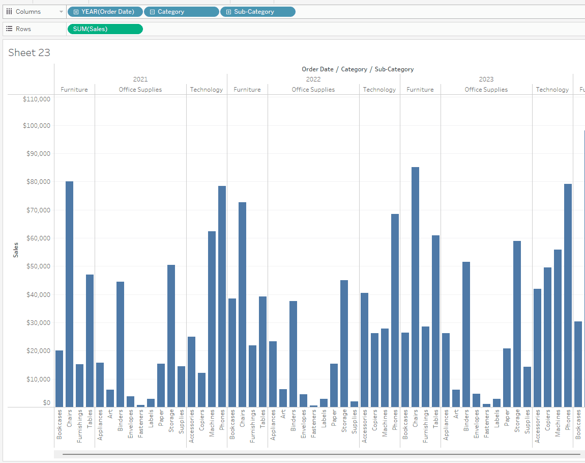
Drag Profit to Detail on the Marks card. Now when you hover over any column on your chart, you'll see the profit data is there for that category, sub-category, and year of order date.
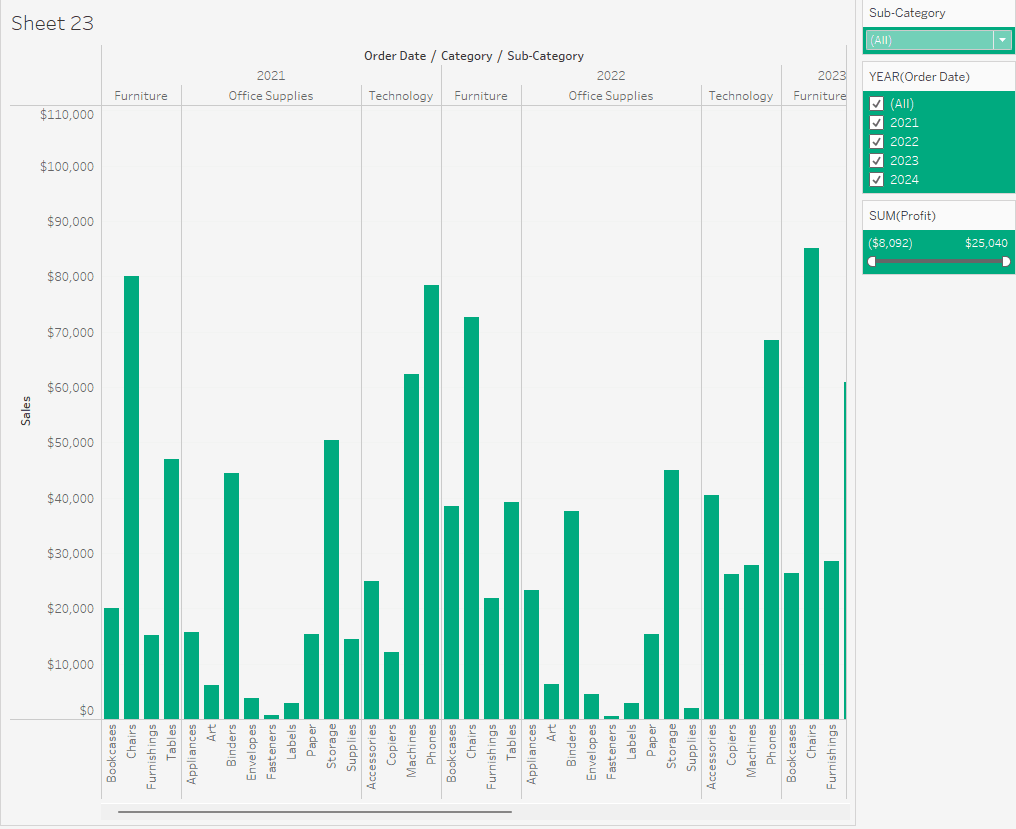
Right click on SUM(Profit) in the Marks card and choose Show Filter. You'll see this on the right.
Also right click on Order Date and Sub-Category and choose Show Filter.
Change the Sub-Category filter to Multiple Values (dropdown) by clicking on the dropdown arrow when you hover over the filter.
Now we want to format these filters. Click the dropdown arrow again for Sub-Category, choose Format Filter and Set Controls, set the Shading to your desired dark colour, and Body Font to white.
In the Marks card select Color to change the colour of the columns. Finally, right click anywhere on the chart, choose Format, select the colour bucket up the top of the pane, and change the worksheet colour to light grey.
Name this worksheet Viz1.
P.s. We want to maintain consistent formatting across all our visualizations that we will put on our dashboard.
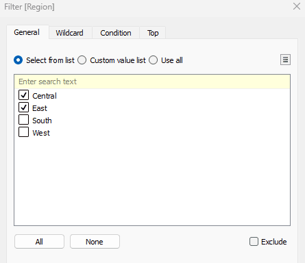
Let's duplicate this sheet by right clicking on the Viz1 tab down the bottom and name it Viz2. In the Viz2 sheet, drag Region to Rows. Then, right click on Region and click Filter.
Only select Central and East. Click OK.
Hover over the SUM(Profit) filter to the right, click the dropdown arrow, and click At Most.
Change the second value in this filter to -3000.
This will give us the negative profit greater than 3000 by region and subcategory.
Rename the worksheet to "Negative Profit > 3000 by Region and Sub-Category".
Now we want to hide our filter cards. For each arrow dropdown select Hide Card.
Create a new worksheet, and name it Viz3.
For this sheet we'll create a map with the Sales by State with profit values showing in the tooltip.
Double click on the State/Province field, then drag Sales to the detail box in the Marks card.
We now have the circles on the map representing the sales.
Now drag Profit to the tooltip box in the Marks card. When we hover over the circles we can now see the profit as well.
Right click on Order Date and click Show Filter. Click the dropdown arrow this filter, choose Format Filter and Set Controls, set the Shading to your desired dark colour, and Body Font to white.

We can also change the size of the circles by clicking on the size box in the Marks card, and change the colour by clicking on the colour box in the Marks card. Rename the sheet "Sales by State Map with Profit Values". Change the worksheet background to light grey.
Duplicate this sheet and call it Viz4. Edit the title and name it "Total Sales by Top 20 Cities". Click the plus sign on State/Province in the Marks card to add City.
Right click on City and select Filter, then go to the Top tab.

Click By Field, change the Top 10 to a 20, and change the by Category dropdown to Sales.
This will filter the top 20 cities based on the sum of sales. Change the title to "Total Sales by Top 20 Cities".
Create a worksheet and name it Viz5.
Drag Country/Region and State/Province to Rows, and right click on the Sales field and choose Add to Sheet.
This is the same as dragging Sales to the Text box in the Marks card.
Right click on Profit and choose Add to Sheet as well.
Right click on Order Date and choose Show Filter, as well as for State/Province.
Hover over the State/Province filter to click the dropdown arrow, and choose Multiple Values (dropdown).
Drag and drop the Order Date filter above the State/Province filter.
Go ahead and format these filters the way we have been formatting them, and change the background to light grey.
Head to the analytics tab from the left Data Pane and drag and drop Totals to Column Grand Totals.
Change the title of the sheet to "Sales and Profit by State".
Creating dashboard 1
Click the create dashboard box down the bottom.
For the size dropdown, custom edit the size so that it fits your screen.
Tick show dashboard title down the bottom, then edit this title to say "Sales and Profit by State".
You can find all your visualizations in the left pane. Drag & drop Viz1 onto the canvas.
Hover over the Profit filter, click the dropdown arrow, and remove this filter from the dashboard.
Now, drag and drop Viz5 to the right of Viz1. Adjust this Viz so that it fits nicely.
Remove both the Year of Order Date filter, and the State/Province filter.
Now, we want to get rid of the table title "Sales and Profit by State", so right click on this and choose Hide title. Also hide the title on the column chart.
Click on Viz5 (the table), click the dropdown arrow, and select Use as Filter.
When you click on a State in the table, it will filter the column chart (Viz1) based on this State.
Format the background of the dashboard with light grey shading - go to the Dashboard menu on the top bar, click Format, and change the colour on the left pane.
Name this sheet the same as its title.
Creating dashboard 2
Create a new dashboard sheet, and adjust your sizing.
Drag and drop Viz2 and Viz3 side by side.

Hide the titles for the map, and edit the title for our Negative Profit to just "Negative Profit > 3000".
Now, because the map is by state and the chart is by region, we want to add the states to the chart.
Select your chart, and in the top right click on the go to sheet icon to get back to that sheet.
Now, we are going to drag State/Province to the Rows shelf.
Go back to the dashboard.
Let's go ahead and name the dashboard "Sales and Negative Profit by State". Then, add the light grey shading to the dashboard.

You'll notice that you can't delete sheets that are on a dashboard - only hide them.
Let's create a new dashboard sheet and adjust the size to fit our screen.
Tick Show dashboard title down the bottom left, then under the Dashboard tab up the top click format to give it the light grey background. Name this sheet "Top Sales by City".
Add Viz4 to the canvas, and hide this map's title.
Now we want to add a URL to the tooltip of a mark on this map.
Go to the Dashboard tab up the top, and click Actions.
Go to This sheet, then click Add Action. Choose Go to URL.
Change the default Name to SimpleAnalytics. To the right we have 'Run action on'. Hover indicates when you hover over a mark, it'll run the action (open the URL), if you choose Select it means if you click on any of the marks it'll open the URL, if you choose Menu you still have to click on the mark - however the tooltip will open and the link will be at the bottom.
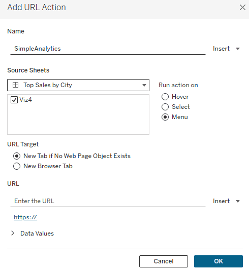
For the URL Target choose New Browser Tab, and for the URL box just add the link excluding http://
i.e. add simpleanalytics.co.nz
Click OK for both boxes.
Now when you click on a mark, the URL will show at the bottom of the tooltip for you to click.
When you add an image to a dashboard page (i.e. a logo) you can have it link to a URL as well.
Under Objects in the Dashboard pane, drag and drop Image to the Filter pane on the right.


Choose an image/your logo, and add a URL to open when the image is clicked.
In that box, put http://simpleanalytics.co.nz
Now, click on the dropdown arrow for the image and select Floating.
Move it to the bottom right corner of the map. When you click it, it will open the URL.

For our last dashboard, I want you to create your own using whatever sheets you want to use. This could include making adjustments like removing unnecessary filters, or maybe using one of your visualizations as a filter.
Go ahead and add a story sheet.
Adjust as necessary to fit your screen.
Then, go to the Story menu, choose Format, and select our light grey shading.
After exiting from the Format pane, you'll notice all of the sheets and dashboards in your workbook. You can use them individually or in groups as 'story points'.
Drag our Sales and Profit by State dashboard onto the canvas. Since we have two visualizations that are somewhat related to eachother, we are going to leave them without adding something new.
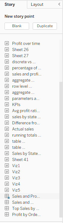
Select Blank up the top of the pane.
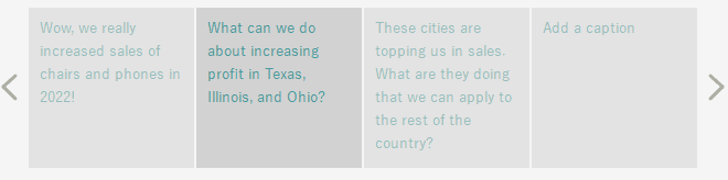
Notice now that we have two captions up the top.
For this one, drag and drop the Sales and Negative Profit by State onto the canvas. Choose another Blank story point, then drag Top Sales by City. Finally add one more Blank story point and add your own dashboard that you created.
Name the story tab.
Feel free to add your own captions based on the dashboards.
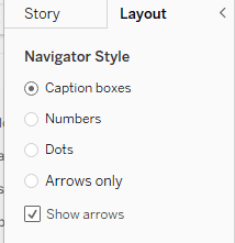
You can change the Layout of the story in this tab.
Congratulations! You have now created multiple dashboards and a story.
Introduction
Tableau transforms raw data into insightful narratives through interactive dashboards. With its user-friendly interface and strong features, these dashboards turn complex data into attractive, easily digestible stories, making data-driven insights accessible and impactful. Users can blend data from various sources, customize visualizations, and create dynamic, real-time dashboards to communicate trends, patterns, and key insights effectively, driving informed decision-making.
First off, make sure you're in the Sample Superstore Workbook.
Open a new worksheet.
Drag Order Date, Category, and Sub-Category to Columns. Then drag Sales to Rows.
Drag Profit to Detail on the Marks card. Now when you hover over any column on your chart, you'll see the profit data is there for that category, sub-category, and year of order date.
Right click on SUM(Profit) in the Marks card and choose Show Filter. You'll see this on the right.
Also right click on Order Date and Sub-Category and choose Show Filter.
Change the Sub-Category filter to Multiple Values (dropdown) by clicking on the dropdown arrow when you hover over the filter.
Now we want to format these filters. Click the dropdown arrow again for Sub-Category, choose Format Filter and Set Controls, set the Shading to your desired dark colour, and Body Font to white.
In the Marks card select Color to change the colour of the columns. Finally, right click anywhere on the chart, choose Format, select the colour bucket up the top of the pane, and change the worksheet colour to light grey.
Name this worksheet Viz1.
P.s. We want to maintain consistent formatting across all our visualizations that we will put on our dashboard.
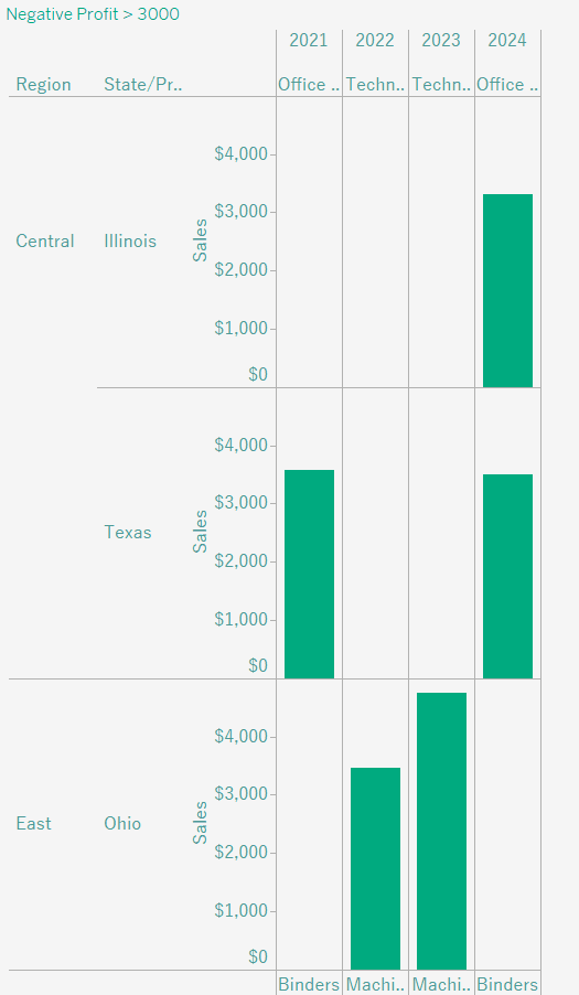
Let's duplicate this sheet by right clicking on the Viz1 tab down the bottom and name it Viz2. In the Viz2 sheet, drag Region to Rows. Then, right click on Region and click Filter.
Only select Central and East. Click OK.
Hover over the SUM(Profit) filter to the right, click the dropdown arrow, and click At Most.
Change the second value in this filter to -3000.
This will give us the negative profit greater than 3000 by region and subcategory.
Rename the worksheet to "Negative Profit > 3000 by Region and Sub-Category".
Now we want to hide our filter cards. For each arrow dropdown select Hide Card.
Create a new worksheet, and name it Viz3.
For this sheet we'll create a map with the Sales by State with profit values showing in the tooltip.
Double click on the State/Province field, then drag Sales to the detail box in the Marks card.
We now have the circles on the map representing the sales.
Now drag Profit to the tooltip box in the Marks card. When we hover over the circles we can now see the profit as well.
Right click on Order Date and click Show Filter. Click the dropdown arrow this filter, choose Format Filter and Set Controls, set the Shading to your desired dark colour, and Body Font to white.
We can also change the size of the circles by clicking on the size box in the Marks card, and change the colour by clicking on the colour box in the Marks card. Rename the sheet "Sales by State Map with Profit Values". Change the worksheet background to light grey.
Duplicate this sheet and call it Viz4. Edit the title and name it "Total Sales by Top 20 Cities". Click the plus sign on State/Province in the Marks card to add City.
Right click on City and select Filter, then go to the Top tab.
Click By Field, change the Top 10 to a 20, and change the by Category dropdown to Sales.
This will filter the top 20 cities based on the sum of sales. Change the title to "Total Sales by Top 20 Cities".
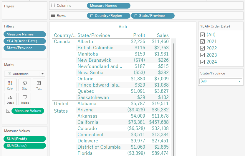
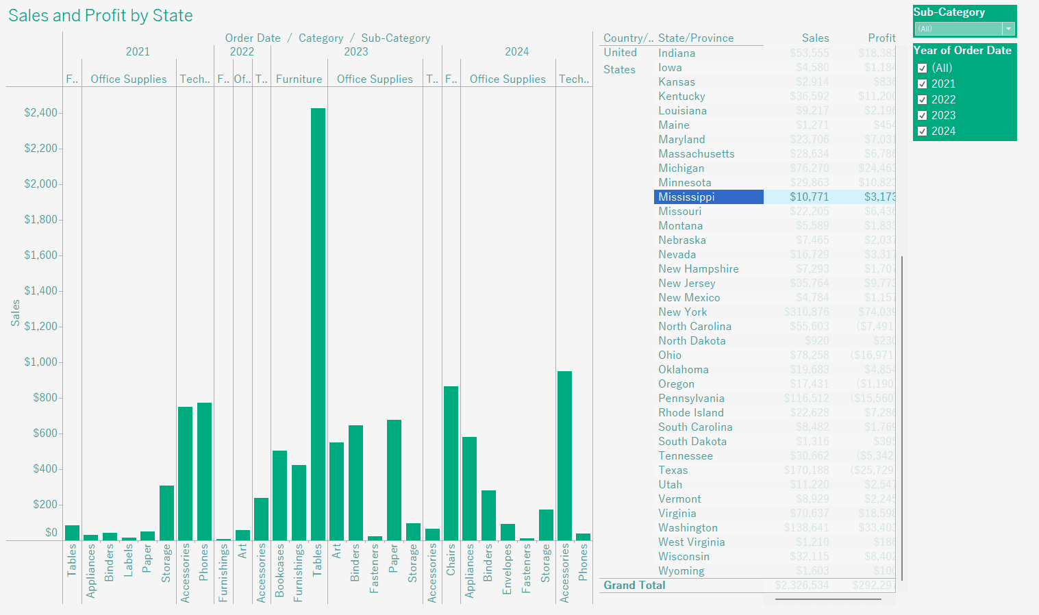
Create a worksheet and name it Viz5.
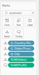
Drag Country/Region and State/Province to Rows, and right click on the Sales field and choose Add to Sheet.
This is the same as dragging Sales to the Text box in the Marks card.
Right click on Profit and choose Add to Sheet as well.
Right click on Order Date and choose Show Filter, as well as for State/Province.
Hover over the State/Province filter to click the dropdown arrow, and choose Multiple Values (dropdown).
Drag and drop the Order Date filter above the State/Province filter.
Go ahead and format these filters the way we have been formatting them, and change the background to light grey.
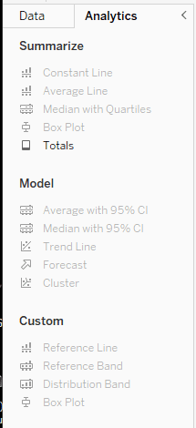
Head to the analytics tab from the left Data Pane and drag and drop Totals to Column Grand Totals.
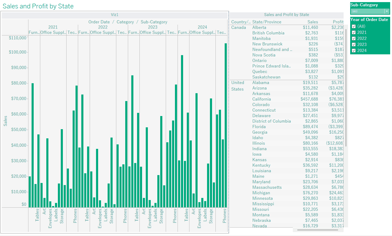
Change the title of the sheet to "Sales and Profit by State".
Creating dashboard 1
Click the create dashboard box down the bottom.
For the size dropdown, custom edit the size so that it fits your screen.
Tick show dashboard title down the bottom, then edit this title to say "Sales and Profit by State".
You can find all your visualizations in the left pane. Drag & drop Viz1 onto the canvas.
Hover over the Profit filter, click the dropdown arrow, and remove this filter from the dashboard.
Now, drag and drop Viz5 to the right of Viz1. Adjust this Viz so that it fits nicely.
Remove both the Year of Order Date filter, and the State/Province filter.
Now, we want to get rid of the table title "Sales and Profit by State", so right click on this and choose Hide title. Also hide the title on the column chart.
Click on Viz5 (the table), click the dropdown arrow, and select Use as Filter.
When you click on a State in the table, it will filter the column chart (Viz1) based on this State.
Format the background of the dashboard with light grey shading - go to the Dashboard menu on the top bar, click Format, and change the colour on the left pane.
Name this sheet the same as its title.
Creating dashboard 2
Create a new dashboard sheet, and adjust your sizing.
Drag and drop Viz2 and Viz3 side by side.
Hide the titles for the map, and edit the title for our Negative Profit to just "Negative Profit > 3000".
Now, because the map is by state and the chart is by region, we want to add the states to the chart.
Select your chart, and in the top right click on the go to sheet icon to get back to that sheet.
Now, we are going to drag State/Province to the Rows shelf.
Go back to the dashboard.
Let's go ahead and name the dashboard "Sales and Negative Profit by State". Then, add the light grey shading to the dashboard.
You'll notice that you can't delete sheets that are on a dashboard - only hide them.
Let's create a new dashboard sheet and adjust the size to fit our screen.
Tick Show dashboard title down the bottom left, then under the Dashboard tab up the top click format to give it the light grey background. Name this sheet "Top Sales by City".
Add Viz4 to the canvas, and hide this map's title.
Now we want to add a URL to the tooltip of a mark on this map.
Go to the Dashboard tab up the top, and click Actions.
Go to This sheet, then click Add Action. Choose Go to URL.
Change the default Name to SimpleAnalytics. To the right we have 'Run action on'. Hover indicates when you hover over a mark, it'll run the action (open the URL), if you choose Select it means if you click on any of the marks it'll open the URL, if you choose Menu you still have to click on the mark - however the tooltip will open and the link will be at the bottom.
For the URL Target choose New Browser Tab, and for the URL box just add the link excluding http://
i.e. add simpleanalytics.co.nz
Click OK for both boxes.
Now when you click on a mark, the URL will show at the bottom of the tooltip for you to click.
When you add an image to a dashboard page (i.e. a logo) you can have it link to a URL as well.
Under Objects in the Dashboard pane, drag and drop Image to the Filter pane on the right.
Choose an image/your logo, and add a URL to open when the image is clicked.
In that box, put http://simpleanalytics.co.nz
Now, click on the dropdown arrow for the image and select Floating.
Move it to the bottom right corner of the map. When you click it, it will open the URL.
For our last dashboard, I want you to create your own using whatever sheets you want to use. This could include making adjustments like removing unnecessary filters, or maybe using one of your visualizations as a filter.
Go ahead and add a story sheet.
Adjust as necessary to fit your screen.
Then, go to the Story menu, choose Format, and select our light grey shading.
After exiting from the Format pane, you'll notice all of the sheets and dashboards in your workbook. You can use them individually or in groups as 'story points'.
Drag our Sales and Profit by State dashboard onto the canvas. Since we have two visualizations that are somewhat related to eachother, we are going to leave them without adding something new.
Select Blank up the top of the pane.
Notice now that we have two captions up the top.
For this one, drag and drop the Sales and Negative Profit by State onto the canvas. Choose another Blank story point, then drag Top Sales by City. Finally add one more Blank story point and add your own dashboard that you created.
Name the story tab.
Feel free to add your own captions based on the dashboards.
You can change the Layout of the story in this tab.
Congratulations! You have now created multiple dashboards and a story.
CONTENT
SHARE