CONTENT
Tableau Fundamentals
Discover how to use Tableau for creating interactive dashboards, connecting to data sources, and visualizing data through user-friendly steps and features.


Saartje Ly
Data Engineering Intern
Introduction
Tableau is a powerful and versatile data visualization tool created to help people see and understand their data. Whether you are a business professional, data analyst, or researcher, Tableau offers a user-friendly interface and a collection of features that allow you to make interactive and shareable dashboards, turning your raw data into insights.
Firstly, you'll want to open your Tableau App.
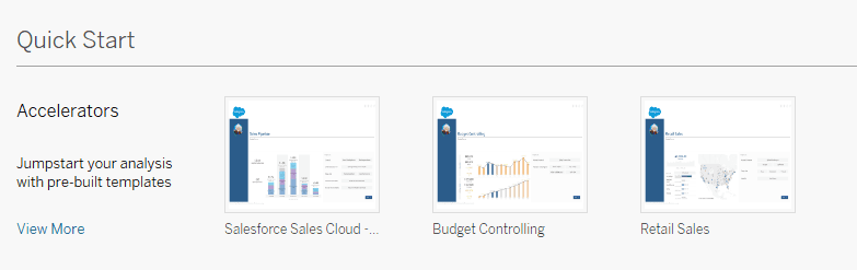
You’ll see Accelerators down the bottom. Accelerators are pre-built dashboards that you can use and swap out data with your own data if necessary.
In this example we are using a Microsoft Access Database.
To the left, you have your Connect pane. Under ‘To a File’, click on Microsoft Access.
When you see this pop-up, browse for your data file.

Click Open when done.
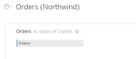
You will now be in the Data source page.
Data source view
You can click and drag tables from the left pane onto the canvas to view, however you can't drag and drop more than one table at a time. So what can we do?
Double click on your data table box.

This will bring us to a view like so.
Now, try to drag and drop another table onto the canvas to join the two.
The two tables are Inner joined on Order ID. This for example means that only orders with order details extended will show up in the joined data table.
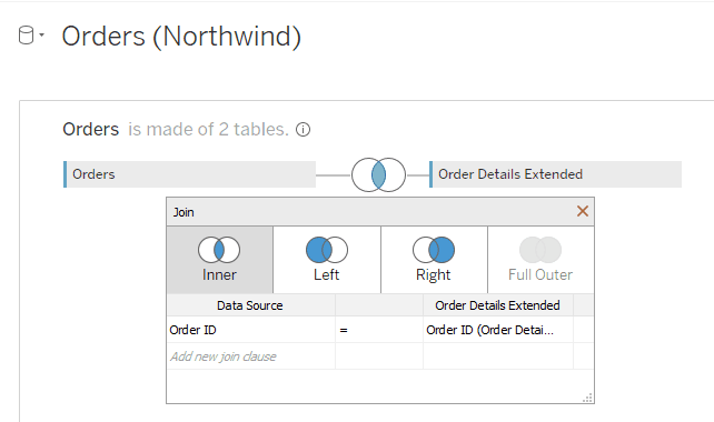
Drag as many tables as you’d like to join them all together.

Exit the view by clicking the X at the top right corner.
You can view the result of your join in your table at the bottom of the page.

Click the gear icon to be able to sort your rows, and click the arrow icon to see the next 100 rows.

Sheet view
Click on ‘Sheet 1’ on the bottom left to navigate to your sheet view.
To the left you’ll see the sidebar. This lists all your tables and fields.
The sidebar tells you with icons whether your fields are geographic, numeric, or text.

Note: any numeric field in Tableau will be converted to a measure. For example, if we had unit price and wanted to use it in our visualization, it would automatically do the sum of the unit price.
Now, we want to drag and drop a field into our Columns shelf up the top.
We should be able to see some information building on the canvas.
Add a geographic field to both the Columns and Rows shelf.

We receive a table but want to visualize a map with our geographic data. The Show Me drop down on the top right corner should be open and displaying all the possible plots. Click on a map visualization.
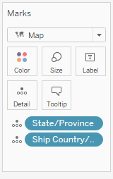
Add another geographic field (try Country/Region) to the Marks box to the left. This should display shaded areas on the map.
Change the name of your plot by double clicking on ‘Sheet 1’ at the top.
Congratulations, you have created your first visualization in Tableau!
To create another sheet, click the first plus sign on the bottom left corner.
Let’s add some data to this new sheet.
Here, I have added my Order Date data again, but it has converted it to Year.
If you encounter a similar issue, hover over the data box, click the down arrow, and select your desired data format.
I changed my format to day, and added a numeric field to my Rows shelf.
Now that we have two visualizations created, we are going to make a dashboard which allows you to see several views at the same time.
Dashboards
Click the second plus sign on the bottom left to create a Dashboard.
To the left you’ll notice your visualization sheets. Click and drag both onto the canvas.
With a visualization selected, you should be able to see a gray options bar. Click on the down arrow and find Filters to be able to filter your visualizations by.
If you want the filter of one graph to impact the filtering of another, click on the down arrow, and select ‘Use as Filter’.
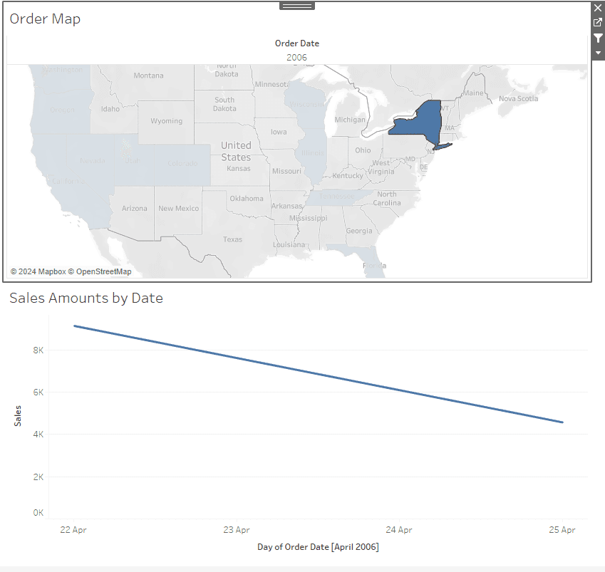
For example, we are using the Order Map as the Filter. We select NY and see that our other graph filters based on NY.
Double click on the names at the bottom left to change them.
Introduction
Tableau is a powerful and versatile data visualization tool created to help people see and understand their data. Whether you are a business professional, data analyst, or researcher, Tableau offers a user-friendly interface and a collection of features that allow you to make interactive and shareable dashboards, turning your raw data into insights.
Firstly, you'll want to open your Tableau App.
You’ll see Accelerators down the bottom. Accelerators are pre-built dashboards that you can use and swap out data with your own data if necessary.
In this example we are using a Microsoft Access Database.
To the left, you have your Connect pane. Under ‘To a File’, click on Microsoft Access.
When you see this pop-up, browse for your data file.
Click Open when done.
You will now be in the Data source page.
Data source view
You can click and drag tables from the left pane onto the canvas to view, however you can't drag and drop more than one table at a time. So what can we do?
Double click on your data table box.
This will bring us to a view like so.
Now, try to drag and drop another table onto the canvas to join the two.
The two tables are Inner joined on Order ID. This for example means that only orders with order details extended will show up in the joined data table.
Drag as many tables as you’d like to join them all together.
Exit the view by clicking the X at the top right corner.
You can view the result of your join in your table at the bottom of the page.
Click the gear icon to be able to sort your rows, and click the arrow icon to see the next 100 rows.
Sheet view
Click on ‘Sheet 1’ on the bottom left to navigate to your sheet view.
To the left you’ll see the sidebar. This lists all your tables and fields.
The sidebar tells you with icons whether your fields are geographic, numeric, or text.
Note: any numeric field in Tableau will be converted to a measure. For example, if we had unit price and wanted to use it in our visualization, it would automatically do the sum of the unit price.
Now, we want to drag and drop a field into our Columns shelf up the top.
We should be able to see some information building on the canvas.
Add a geographic field to both the Columns and Rows shelf.
We receive a table but want to visualize a map with our geographic data. The Show Me drop down on the top right corner should be open and displaying all the possible plots. Click on a map visualization.
Add another geographic field (try Country/Region) to the Marks box to the left. This should display shaded areas on the map.
Change the name of your plot by double clicking on ‘Sheet 1’ at the top.
Congratulations, you have created your first visualization in Tableau!
To create another sheet, click the first plus sign on the bottom left corner.
Let’s add some data to this new sheet.
Here, I have added my Order Date data again, but it has converted it to Year.
If you encounter a similar issue, hover over the data box, click the down arrow, and select your desired data format.
I changed my format to day, and added a numeric field to my Rows shelf.
Now that we have two visualizations created, we are going to make a dashboard which allows you to see several views at the same time.
Dashboards
Click the second plus sign on the bottom left to create a Dashboard.
To the left you’ll notice your visualization sheets. Click and drag both onto the canvas.
With a visualization selected, you should be able to see a gray options bar. Click on the down arrow and find Filters to be able to filter your visualizations by.
If you want the filter of one graph to impact the filtering of another, click on the down arrow, and select ‘Use as Filter’.
For example, we are using the Order Map as the Filter. We select NY and see that our other graph filters based on NY.
Double click on the names at the bottom left to change them.
CONTENT
SHARE