CONTENT
Tableau: From foundational to advanced visualizations
Learn about dimensions, measures, and how discrete vs continuous fields impact visualizations using Tableau's Sample Superstore Workbook.


Saartje Ly
Data Engineering Intern
Introduction
Today we will learn about dimensions, measures, and discrete vs continuous fields and how they impact the axes on visualizations using the Sample Superstore Workbook. We will create a crosstab visualization to compare values across different dimensions and work on changing the data type of a date field and changing the date format for the entire workbook. We will answer the question what percentage of total national sales is made in each region on the visualization. We move on to adding distribution bands to a visualization by using the analysis tab and we learn how to view the actual value of the distribution band. Finally, we will create a dual axis to create different ranges of values.
Firstly, make sure you are in the Superstore Workbook.
Cross tab visualization
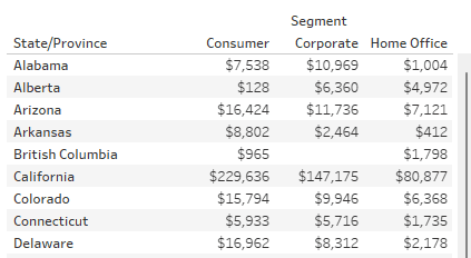
Add Segment to the Columns shelf and State/Province to the Rows shelf.
Drag and drop Sales onto the text box in the Marks card

We are now able to compare the value of sales across different segments and state.
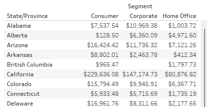
To change the sales numbers to currency format, click the dropdown arrow when you hover over SUM(Sales) in the Marks card. Select Format, then in the format pane under Default, click the dropdown for Numbers. Select Currency (Standard).

Now let’s visualize dates and times
Head back to the Data Source tab.
Dates are not stored in the date time datatype for this data source. I.e. There are no times in the data source. But let’s play make believe for a moment and pretend there should be times. To change the data type, find Fields on the bottom left. Click on the Type symbol of Order Date and change it to Date & Time.

When you expand the Order Date column in the grid, because there are no times in the original data source it changes all the times to 12 am.
Let’s change the type of Order Date back to Date.
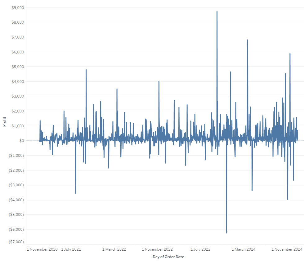
Timeseries chart
Now, let’s create a new worksheet. When you’re using a date field in a visualization, it applies an automatic date format to it.
Drag the Order Date field to Rows.
In your Data pane right click on Order Date, choose Default Properties, then Date format.

Choose the date in the format day month year. I.e. 14 March 2001. Click OK.
Now, move Order Date to Columns and put Profit in Rows, and in the dropdown for Order Date, change to the second Day option.
Any time you use Dates in a visualization, you’re doing time series analysis.
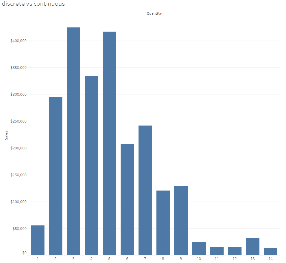
Continuous & Discrete fields
Let’s now create a new worksheet.
If you look at your Data pane, you’ll notice the green fields are continuous and blue ones are discrete.
Drag Sales to Rows, and Quantity to Columns.
We receive a scatterplot which makes no sense.
Click on the dropdown when you hover over SUM(Quantity) in Columns, and choose Dimension to change it from a measure to a field. It is not doing the aggregate of sum anymore, it’s just showing all of the quantities on the chart.

Click on the dropdown again and change it from continuous to discrete. Now each individual quantity has its own part on the x axis.
Percentage of total national sales is made in each region
We now want to answer what percentage of total national sales are made in each region. Create a new sheet and drag Sales to Columns. Then, drag Region to Rows.
Navigate to Analysis on the top menu bar, click on it, hover over ‘Percentage Of’, then choose Column (as our Sales are in a column).
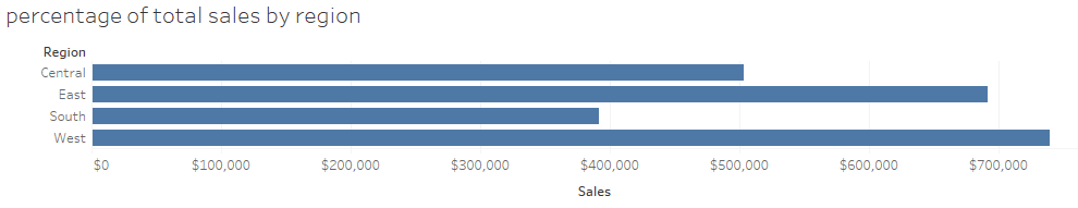
If you hover over any of the regions in the chart, it’ll show you the percentage of total sales.
Change the chart axis back to total sales by going back to Analysis, hover over ‘Percentage Of’, then choose None.
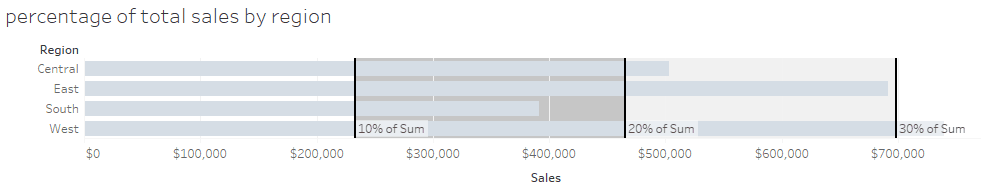
Distributions
Now I will teach you how to do some analytics by visualizing distributions.
Head to the Analytics pane to the left.

Drag and drop Distribution Band onto the visualization, choosing Table.

Click on the Value dropdown and change the Percentages to ‘10,20,30’ and change Percent Of to Sum. When you hover over each percentage band it tells you how much of total sales is what % of the sum.
Multiple axes to compare different measures
We will now visualize multiple axes to compare different measures. Go ahead and create a new sheet. We are going to analyze two measures that have different scales.
Add Order Date to Columns and click its dropdown. Change from Year to the first Quarter option.
Then, drag both Sales and Profit to Rows.
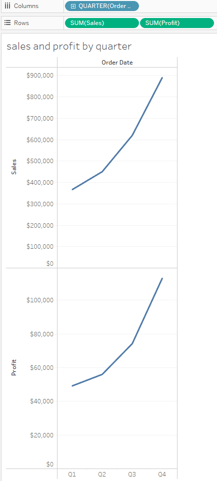
We can see on the left that they have different scales. What we can do is right click on SUM(Profit) in the Rows shelf, and choose Dual axis.
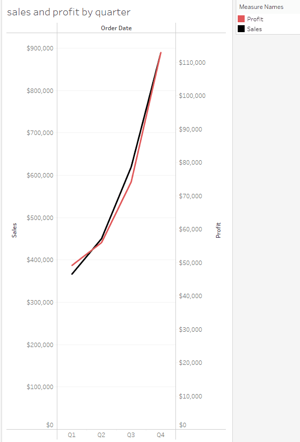
We now have a combined axes with the Sales axis on the left and Profit axis on the right.
Introduction
Today we will learn about dimensions, measures, and discrete vs continuous fields and how they impact the axes on visualizations using the Sample Superstore Workbook. We will create a crosstab visualization to compare values across different dimensions and work on changing the data type of a date field and changing the date format for the entire workbook. We will answer the question what percentage of total national sales is made in each region on the visualization. We move on to adding distribution bands to a visualization by using the analysis tab and we learn how to view the actual value of the distribution band. Finally, we will create a dual axis to create different ranges of values.
Firstly, make sure you are in the Superstore Workbook.
Cross tab visualization
Add Segment to the Columns shelf and State/Province to the Rows shelf.
Drag and drop Sales onto the text box in the Marks card
We are now able to compare the value of sales across different segments and state.
To change the sales numbers to currency format, click the dropdown arrow when you hover over SUM(Sales) in the Marks card. Select Format, then in the format pane under Default, click the dropdown for Numbers. Select Currency (Standard).
Now let’s visualize dates and times
Head back to the Data Source tab.
Dates are not stored in the date time datatype for this data source. I.e. There are no times in the data source. But let’s play make believe for a moment and pretend there should be times. To change the data type, find Fields on the bottom left. Click on the Type symbol of Order Date and change it to Date & Time.
When you expand the Order Date column in the grid, because there are no times in the original data source it changes all the times to 12 am.
Let’s change the type of Order Date back to Date.
Timeseries chart
Now, let’s create a new worksheet. When you’re using a date field in a visualization, it applies an automatic date format to it.
Drag the Order Date field to Rows.
In your Data pane right click on Order Date, choose Default Properties, then Date format.
Choose the date in the format day month year. I.e. 14 March 2001. Click OK.
Now, move Order Date to Columns and put Profit in Rows, and in the dropdown for Order Date, change to the second Day option.
Any time you use Dates in a visualization, you’re doing time series analysis.
Continuous & Discrete fields
Let’s now create a new worksheet.
If you look at your Data pane, you’ll notice the green fields are continuous and blue ones are discrete.
Drag Sales to Rows, and Quantity to Columns.
We receive a scatterplot which makes no sense.
Click on the dropdown when you hover over SUM(Quantity) in Columns, and choose Dimension to change it from a measure to a field. It is not doing the aggregate of sum anymore, it’s just showing all of the quantities on the chart.
Click on the dropdown again and change it from continuous to discrete. Now each individual quantity has its own part on the x axis.
Percentage of total national sales is made in each region
We now want to answer what percentage of total national sales are made in each region. Create a new sheet and drag Sales to Columns. Then, drag Region to Rows.
Navigate to Analysis on the top menu bar, click on it, hover over ‘Percentage Of’, then choose Column (as our Sales are in a column).
If you hover over any of the regions in the chart, it’ll show you the percentage of total sales.
Change the chart axis back to total sales by going back to Analysis, hover over ‘Percentage Of’, then choose None.
Distributions
Now I will teach you how to do some analytics by visualizing distributions.
Head to the Analytics pane to the left.
Drag and drop Distribution Band onto the visualization, choosing Table.
Click on the Value dropdown and change the Percentages to ‘10,20,30’ and change Percent Of to Sum. When you hover over each percentage band it tells you how much of total sales is what % of the sum.
Multiple axes to compare different measures
We will now visualize multiple axes to compare different measures. Go ahead and create a new sheet. We are going to analyze two measures that have different scales.
Add Order Date to Columns and click its dropdown. Change from Year to the first Quarter option.
Then, drag both Sales and Profit to Rows.
We can see on the left that they have different scales. What we can do is right click on SUM(Profit) in the Rows shelf, and choose Dual axis.
We now have a combined axes with the Sales axis on the left and Profit axis on the right.
CONTENT
SHARE