CONTENT
Tableau: Formatting a visualization
Learn to format Tableau visualizations by customizing fonts, colors, filters, and themes using the Sample Superstore workbook for enhanced appearance and functionality.


Saartje Ly
Data Engineering Intern
Formatting a visualization
Firstly, make sure you are in the Sample Superstore Workbook.

Create a new sheet.
Put Segment and Category in Columns, State/Province in Rows, and Sales in the Text box for the Marks card.

Click on the Format tab up the top bar, then choose Workbook.

At this workbook level we can format the fonts and lines.
Click on the All dropdown under Fonts, then change the font from Tableau Book to your desired one.
Across all sheets, you should see that all fonts have changed to the new one.
Let's say you want a consistent colour across all the workbooks. Go back to the All dropdown, and in the colour grid select your desired colour.
Font size can be changed in other dropdowns.
If you don't like your changes and want to go back to the original state, down the bottom there is a Reset to Defaults button.
The next thing we want to do, is right click where it says Segment / Category up the top, and Hide Field Labels for Columns.
Make sure to expand the columns if the titles are being cut off.
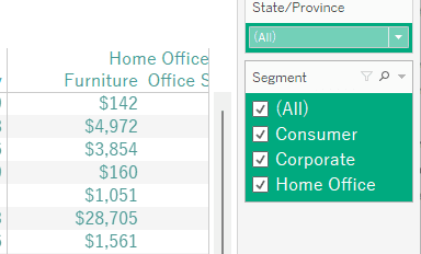
Then, right click on Segment in Columns and select Show Filter. Do the same for State/Province.

Hover over the State/Province title on the filter to the right, click the arrow dropdown, then select Multiple Values (dropdown).
Hover over the arrow dropdown for the State/Province filter again, this time choosing Format Filter and Set Controls.

Change the Body Shading to colour match with your text, then change the Body Font colour to white.
Something else that will give your users more functionality - When you hover over State/Province a plus sign should show up. Click this to show city level data.
Now, we want to add the grand total to the rows and columns of this table. Make sure you have exited out of the Format pane, then head to the Analytics pane on the left.

Click and drag Totals onto the table. Drop it on Column Grand Totals. If you look at the bottom of the table you have a grand total for every column. Drag Totals again, this time dropping it on Row Grand Totals. To the right we will have a grand total for every row.
Right click on the Grand total heading, choose Format, then change the Label to "Grand Totals by State".

Now, let's give our worksheet a colour. Right click anywhere on the table and click Format.

Choose the paint bucket up the top to get to shading, then for the Worksheet colour choose the lightest grey.
Now we are going to choose a Workbook Theme.
Under Format in the top bar, choose Workbook Theme, and select your desired theme.
Create a new worksheet.
Put Order Date to Columns, and Profit to Rows. Change from YEAR(Order Date) to DAY(Order Date), by clicking on the dropdown arrow and choosing the second Day option.

Let's give the background the same grey colour by right clicking anywhere on the plot, clicking Format, selecting the paint bucket, and changing colour to light grey.
Now let's say we want to change the line to green. Click on the Colour box on the Marks card to do this.

There you have it - the basics of visualization formatting :)
Formatting a visualization
Firstly, make sure you are in the Sample Superstore Workbook.
Create a new sheet.
Put Segment and Category in Columns, State/Province in Rows, and Sales in the Text box for the Marks card.
Click on the Format tab up the top bar, then choose Workbook.
At this workbook level we can format the fonts and lines.
Click on the All dropdown under Fonts, then change the font from Tableau Book to your desired one.
Across all sheets, you should see that all fonts have changed to the new one.
Let's say you want a consistent colour across all the workbooks. Go back to the All dropdown, and in the colour grid select your desired colour.
Font size can be changed in other dropdowns.
If you don't like your changes and want to go back to the original state, down the bottom there is a Reset to Defaults button.
The next thing we want to do, is right click where it says Segment / Category up the top, and Hide Field Labels for Columns.
Make sure to expand the columns if the titles are being cut off.
Then, right click on Segment in Columns and select Show Filter. Do the same for State/Province.
Hover over the State/Province title on the filter to the right, click the arrow dropdown, then select Multiple Values (dropdown).
Hover over the arrow dropdown for the State/Province filter again, this time choosing Format Filter and Set Controls.
Change the Body Shading to colour match with your text, then change the Body Font colour to white.
Something else that will give your users more functionality - When you hover over State/Province a plus sign should show up. Click this to show city level data.
Now, we want to add the grand total to the rows and columns of this table. Make sure you have exited out of the Format pane, then head to the Analytics pane on the left.
Click and drag Totals onto the table. Drop it on Column Grand Totals. If you look at the bottom of the table you have a grand total for every column. Drag Totals again, this time dropping it on Row Grand Totals. To the right we will have a grand total for every row.
Right click on the Grand total heading, choose Format, then change the Label to "Grand Totals by State".
Now, let's give our worksheet a colour. Right click anywhere on the table and click Format.
Choose the paint bucket up the top to get to shading, then for the Worksheet colour choose the lightest grey.
Now we are going to choose a Workbook Theme.
Under Format in the top bar, choose Workbook Theme, and select your desired theme.
Create a new worksheet.
Put Order Date to Columns, and Profit to Rows. Change from YEAR(Order Date) to DAY(Order Date), by clicking on the dropdown arrow and choosing the second Day option.
Let's give the background the same grey colour by right clicking anywhere on the plot, clicking Format, selecting the paint bucket, and changing colour to light grey.
Now let's say we want to change the line to green. Click on the Colour box on the Marks card to do this.
There you have it - the basics of visualization formatting :)
CONTENT
SHARE