CONTENT
Tableau Dashboard tips
Learn to create and format interactive Tableau dashboards, adding features for effective data visualization and enhanced user experience.


Saartje Ly
Data Engineering Intern
Tableau Dashboard tips
Tableau dashboards allow users to combine multiple sheets into a single view, providing a snapshot of key metrics and insights. They are powerful for visualizing, analyzing, and presenting data in an interactive and dynamic way.
Open a new dashboard sheet.
Under Format > Dashboard, here you have the ability to format your dashboard. Play around with these settings then exit the pane, and tick Show dashboard title down the bottom left.
Double click on this title to further edit. I have gone ahead and centered it and made the text larger.
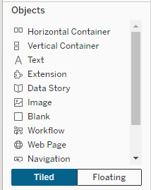
Now let's add our logo. Under Objects in the bottom left corner, click Floating, then click on Image.
Resize the logo and move it to the top corner.
When you add worksheets you should always add a container. Horizontal containers put things left to right of eachother, and vertical containers stack things.
Drag and drop a Sheet into the middle of the page. If it isn't taking up the entire view, click on the down arrow in the top right corner of the sheet, and untick Floating.

Next, grab a Horizontal container from Objects and put it at the bottom of the dashboard.
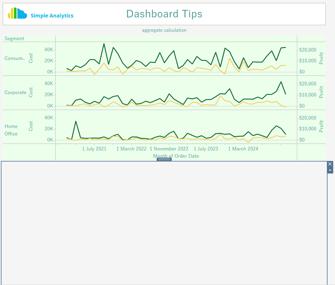
Grab two charts to put side by side in this container by dragging and dropping.

I always like to have everything fully visible in my tables, so if your tables are squished or they have a scroll bar down the bottom, resize them to display all their values.
Choose one of your sheets to open (click Go to Sheet in the top right corner of the sheet), and click Tooltip in the Marks card.
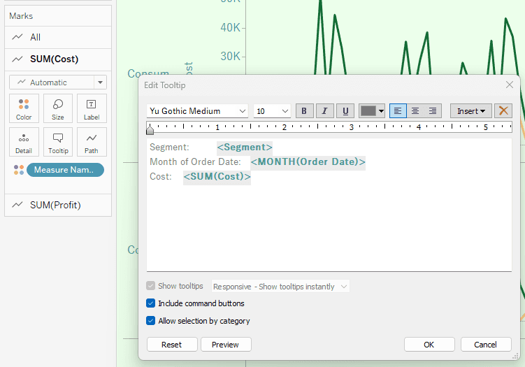
Here you can edit your tooltip to be whatever you'd like.
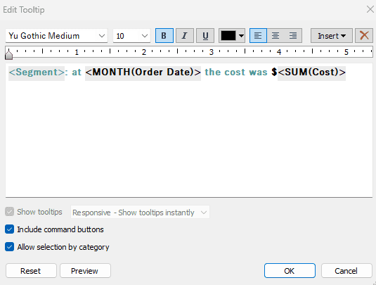
Click preview to make sure it looks how you want it before clicking OK.
Head back to your dashboard.
The next thing we'd like to do is add a filter action.
Go to Dashboard > Action up the top, choose Add Action, Filter.
Here we are saying whenever we click something on our aggregate calculation, it filters the Crosstab and Line on Select. Click OK.

Next, we want to add an information icon to add some information about the data/dashboard.
Open a new sheet and call it Icon.
Click on the dropdown arrow next to the search bar in the left pane and select Create Calculated Field. Name this Icon.
Put two quotation marks in the box and click OK.

Drag and drop this field (in the left pane) to the Rows shelf.
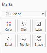
In the Marks card change from Automatic to Shape.
Now, let's import in the shape we want. After you downloaded the icon you want to use, navigate to the My Tableau Repository folder on your desktop and find the Shapes folder. Here you will find the various shape palettes that are by default already available on Tableau. To add your custom shape, simply create a new folder within the Shapes folder and add your shape to it.
Click on Shape in the Marks card, and go to More shapes.

Under Select Shape Palette, your custom folder should be there. If at first you can't see it, exit Tableau and reopen it. Click on your image and then click OK.
Right click on your icon, click Format, go to the colour bucket up the top left corner, and change the colour of your worksheet.
Then head to the Borders box next to the colour bucket to remove the Row and Column dividers.

Right click on the box to the left of the icon and untick Show Header
In the Marks card click on Tooltip. Here you will put your information about the dashboard and data. Whenever someone hovers over the icon, they'll see the information.
Go back to your dashboard, then click and drag over your Icon sheet. Right click on it and choose Floating. Right click on the Icon header and choose Hide title.
Click the down arrow to the right of the sheet, hover over fit, and select Entire View.
Resize it, and put it in the top right corner.

Tableau Dashboard tips
Tableau dashboards allow users to combine multiple sheets into a single view, providing a snapshot of key metrics and insights. They are powerful for visualizing, analyzing, and presenting data in an interactive and dynamic way.
Open a new dashboard sheet.
Under Format > Dashboard, here you have the ability to format your dashboard. Play around with these settings then exit the pane, and tick Show dashboard title down the bottom left.
Double click on this title to further edit. I have gone ahead and centered it and made the text larger.
Now let's add our logo. Under Objects in the bottom left corner, click Floating, then click on Image.
Resize the logo and move it to the top corner.
When you add worksheets you should always add a container. Horizontal containers put things left to right of eachother, and vertical containers stack things.
Drag and drop a Sheet into the middle of the page. If it isn't taking up the entire view, click on the down arrow in the top right corner of the sheet, and untick Floating.
Next, grab a Horizontal container from Objects and put it at the bottom of the dashboard.
Grab two charts to put side by side in this container by dragging and dropping.
I always like to have everything fully visible in my tables, so if your tables are squished or they have a scroll bar down the bottom, resize them to display all their values.
Choose one of your sheets to open (click Go to Sheet in the top right corner of the sheet), and click Tooltip in the Marks card.
Here you can edit your tooltip to be whatever you'd like.
Click preview to make sure it looks how you want it before clicking OK.
Head back to your dashboard.
The next thing we'd like to do is add a filter action.
Go to Dashboard > Action up the top, choose Add Action, Filter.
Here we are saying whenever we click something on our aggregate calculation, it filters the Crosstab and Line on Select. Click OK.
Next, we want to add an information icon to add some information about the data/dashboard.
Open a new sheet and call it Icon.
Click on the dropdown arrow next to the search bar in the left pane and select Create Calculated Field. Name this Icon.
Put two quotation marks in the box and click OK.
Drag and drop this field (in the left pane) to the Rows shelf.
In the Marks card change from Automatic to Shape.
Now, let's import in the shape we want. After you downloaded the icon you want to use, navigate to the My Tableau Repository folder on your desktop and find the Shapes folder. Here you will find the various shape palettes that are by default already available on Tableau. To add your custom shape, simply create a new folder within the Shapes folder and add your shape to it.
Click on Shape in the Marks card, and go to More shapes.
Under Select Shape Palette, your custom folder should be there. If at first you can't see it, exit Tableau and reopen it. Click on your image and then click OK.
Right click on your icon, click Format, go to the colour bucket up the top left corner, and change the colour of your worksheet.
Then head to the Borders box next to the colour bucket to remove the Row and Column dividers.
Right click on the box to the left of the icon and untick Show Header
In the Marks card click on Tooltip. Here you will put your information about the dashboard and data. Whenever someone hovers over the icon, they'll see the information.
Go back to your dashboard, then click and drag over your Icon sheet. Right click on it and choose Floating. Right click on the Icon header and choose Hide title.
Click the down arrow to the right of the sheet, hover over fit, and select Entire View.
Resize it, and put it in the top right corner.
CONTENT
SHARE