CONTENT
Report features in Power BI
Learn how to create and format visualizations in Power BI, including adding slicers, drill-through pages, and conditional formatting for dynamic, interactive reports.


Saartje Ly
Data Engineering Intern
In report view, you can drag and drop visualizations into the empty canvas.
To populate these charts, drag and drop data from the Data pane onto these visualizations.
Format your visual
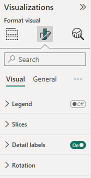
Here, you can customize and style the appearance of your visuals such as colours, fonts, backgrounds, and borders.
Here are a few examples.
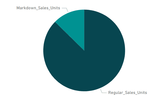
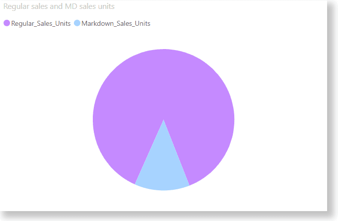
Detail labels:
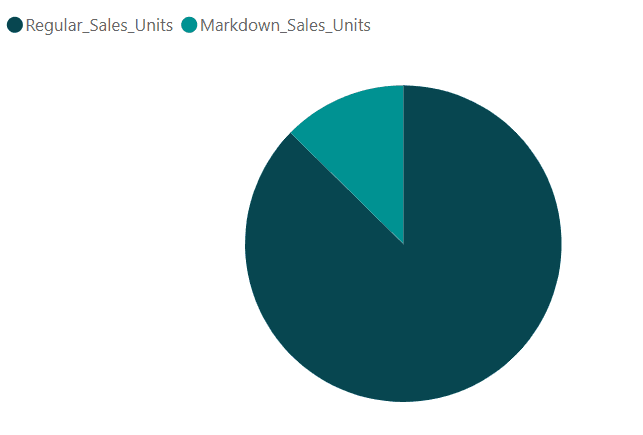
Legends:
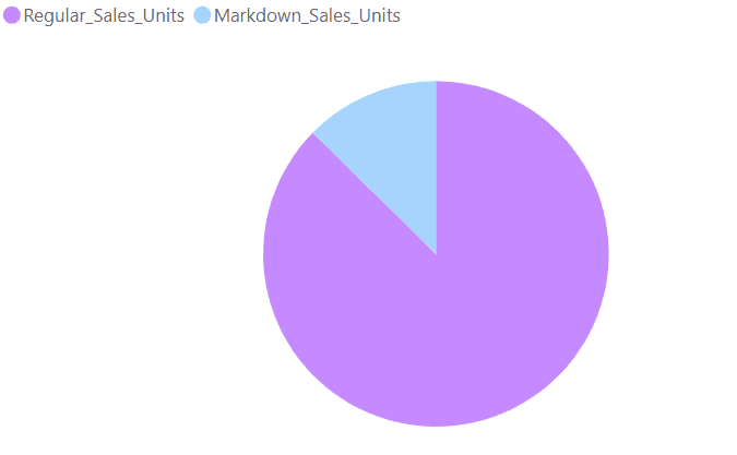
Change colours:
Rotate:

Add a background shadow to your visualization:
1. In Format visual, select the General tab
2. Expand the Effects dropdown
3. Expand the Shadow dropdown, and edit the shadow.
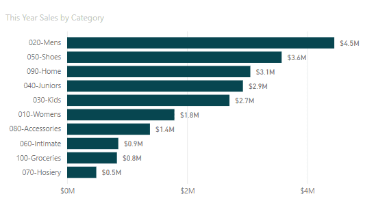
Adding data labels to a visualization
With your visualization selected, navigate to Format visual and find the Data labels bar. Toggle this on.
Tip: You can move or edit objects in groups by ctrl + click to select multiple objects.
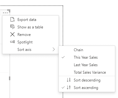
Sorting visualizations
In the top right hand corner of your visualization you will notice three dots.
Click on this and hover over Sort axis to be able to sort your visualization as you please.
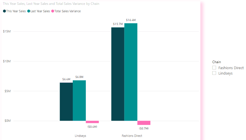
Adding a slicer visualization
A slicer is a visual element that allows users to filter data in a report or dashboard.
Add a slicer to your canvas by dragging and dropping it in.
Drag and drop data from your Data pane on top of the slicer to filter your current visualization by. Here, I have added Chain onto my slicer.
Changing from a vertical list to a dropdown
1. With your slicer selected, head to Format visual
2. Click on the Slicer settings dropdown, then click on the Style box to change.
If you would like to sync slicers across report pages ie, use the same slicer on multiple pages
1. Head to the View tab
2. Click Sync slicers in Show panes
A new Sync slicers pane will pop up
Anything ticked under these two arrows represents a sync
I.e., if a slicer filters one page, the other pages will also get filtered.
The eye represents whether the slicer will be visible on that page
Creating a Drill-through page
Drill-through functionality in Power BI reports allows you to create a specialized page within your report that showcases a particular entity such as a category, store, or territory. You can engage with drill-through by right-clicking on a data point in other report pages, instantly navigating to the dedicated page to explore filtered details specific to that selection.
1. Locate the multi-row card icon in Visualizations and click it
2. Populate this card with data
3. Drag and drop your drill-through field to the Drill through box under Visualizations. i.e., what you want to filter your card by.
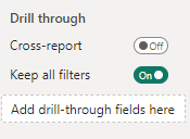
4. Create a new page, put a visualization on it and populate the visualization. Make sure that one of your axes is the same field as your drill-through field.
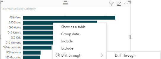
If you hover over the visualization, you should see Right-click to drill through
5. Hover over a category in your visualization, right click, hover over Drill through, and click Drill Through.
It will take you to your drill-through, where the values represent your category.
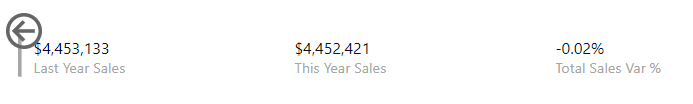
Ctrl + click the arrow to go back to your source page.
Drill-throughs with slicers
Filter using your slicer then create another drill-through for the desired category
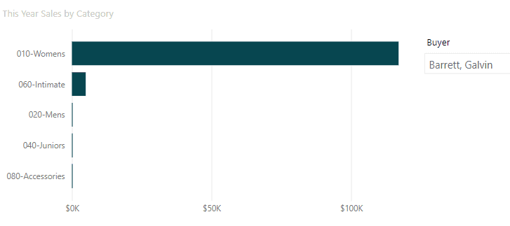
In the Visualizations pane you’ll notice a filter in italics, as it is not a drill through field but that we have used a slicer.
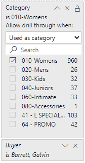
For this example the drill-through values would be for the Womens category for the Buyer Barrett, Galvin. Expand the Buyer box to filter by other buyers, or remove it by clicking the X.
Changing the drill-through arrow
If you don’t like the look of the drill-through arrow, you can change it.
1. Simply click and delete the arrow
2. Head to the Insert tab
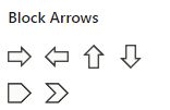
3. Click Shapes inside Elements
4. Select the back Block Arrow
5. With this arrow selected, navigate to Action inside Format shape
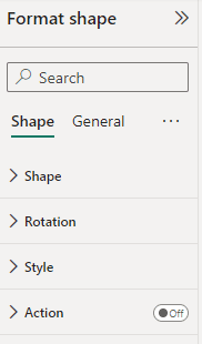
6. Toggle on Action
7. Make sure the Action type is back
8. Resize & position your arrow
Conditional formatting with a table
1. Select your table and navigate to the Visualizations pane to the right.
2. In columns, locate the field you’d like to conditionally format.
3. Right click on the field, hover over conditional formatting, and select your desired option.
I will demonstrate with Background colour.
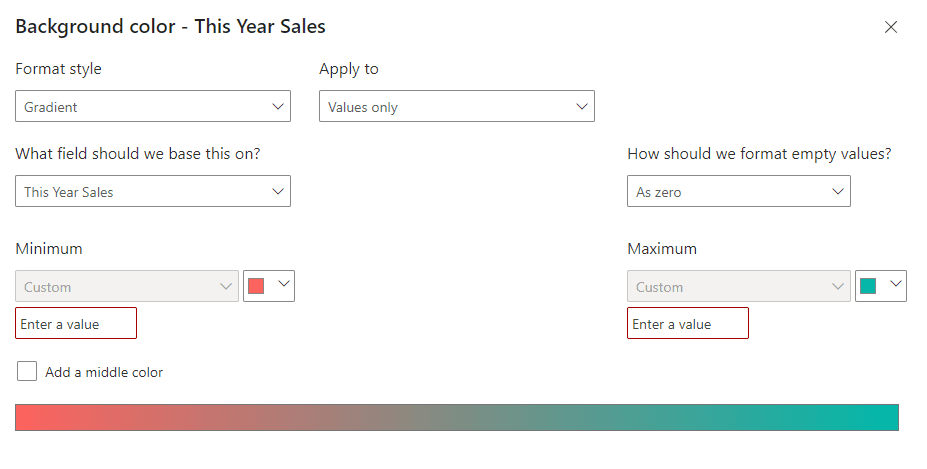
4. Here, I will click Add a middle colour on the bottom left
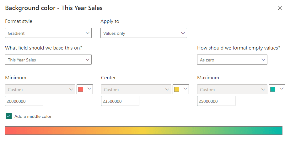
This conditional format is going to colour the background of a sales value. Here, we are saying if it is 20 million we want to colour it red, if it is 23.5 million we want to colour it orange, and if it is 25 million we want to colour it green. Anything in between is coloured by the colour scale.
This is visually intuitive for understanding sales benchmarks.
Bookmarks
Let’s say you visit a report page often where you filter for different categories. You can save your filtered report as a bookmark for those categories you want to track frequently.
1. Inside the View tab, find Bookmarks in Show panes.
2. Click on Bookmarks, and a Bookmarks pane will open to the right.
3. Double click your bookmark to rename it.
In report view, you can drag and drop visualizations into the empty canvas.
To populate these charts, drag and drop data from the Data pane onto these visualizations.
Format your visual
Here, you can customize and style the appearance of your visuals such as colours, fonts, backgrounds, and borders.
Here are a few examples.
Detail labels:
Legends:
Change colours:
Rotate:
Add a background shadow to your visualization:
1. In Format visual, select the General tab
2. Expand the Effects dropdown
3. Expand the Shadow dropdown, and edit the shadow.
Adding data labels to a visualization
With your visualization selected, navigate to Format visual and find the Data labels bar. Toggle this on.
Tip: You can move or edit objects in groups by ctrl + click to select multiple objects.
Sorting visualizations
In the top right hand corner of your visualization you will notice three dots.
Click on this and hover over Sort axis to be able to sort your visualization as you please.
Adding a slicer visualization
A slicer is a visual element that allows users to filter data in a report or dashboard.
Add a slicer to your canvas by dragging and dropping it in.
Drag and drop data from your Data pane on top of the slicer to filter your current visualization by. Here, I have added Chain onto my slicer.
Changing from a vertical list to a dropdown
1. With your slicer selected, head to Format visual
2. Click on the Slicer settings dropdown, then click on the Style box to change.
If you would like to sync slicers across report pages ie, use the same slicer on multiple pages
1. Head to the View tab
2. Click Sync slicers in Show panes
A new Sync slicers pane will pop up
Anything ticked under these two arrows represents a sync
I.e., if a slicer filters one page, the other pages will also get filtered.
The eye represents whether the slicer will be visible on that page
Creating a Drill-through page
Drill-through functionality in Power BI reports allows you to create a specialized page within your report that showcases a particular entity such as a category, store, or territory. You can engage with drill-through by right-clicking on a data point in other report pages, instantly navigating to the dedicated page to explore filtered details specific to that selection.
1. Locate the multi-row card icon in Visualizations and click it
2. Populate this card with data
3. Drag and drop your drill-through field to the Drill through box under Visualizations. i.e., what you want to filter your card by.
4. Create a new page, put a visualization on it and populate the visualization. Make sure that one of your axes is the same field as your drill-through field.
If you hover over the visualization, you should see Right-click to drill through
5. Hover over a category in your visualization, right click, hover over Drill through, and click Drill Through.
It will take you to your drill-through, where the values represent your category.
Ctrl + click the arrow to go back to your source page.
Drill-throughs with slicers
Filter using your slicer then create another drill-through for the desired category
In the Visualizations pane you’ll notice a filter in italics, as it is not a drill through field but that we have used a slicer.
For this example the drill-through values would be for the Womens category for the Buyer Barrett, Galvin. Expand the Buyer box to filter by other buyers, or remove it by clicking the X.
Changing the drill-through arrow
If you don’t like the look of the drill-through arrow, you can change it.
1. Simply click and delete the arrow
2. Head to the Insert tab
3. Click Shapes inside Elements
4. Select the back Block Arrow
5. With this arrow selected, navigate to Action inside Format shape
6. Toggle on Action
7. Make sure the Action type is back
8. Resize & position your arrow
Conditional formatting with a table
1. Select your table and navigate to the Visualizations pane to the right.
2. In columns, locate the field you’d like to conditionally format.
3. Right click on the field, hover over conditional formatting, and select your desired option.
I will demonstrate with Background colour.
4. Here, I will click Add a middle colour on the bottom left
This conditional format is going to colour the background of a sales value. Here, we are saying if it is 20 million we want to colour it red, if it is 23.5 million we want to colour it orange, and if it is 25 million we want to colour it green. Anything in between is coloured by the colour scale.
This is visually intuitive for understanding sales benchmarks.
Bookmarks
Let’s say you visit a report page often where you filter for different categories. You can save your filtered report as a bookmark for those categories you want to track frequently.
1. Inside the View tab, find Bookmarks in Show panes.
2. Click on Bookmarks, and a Bookmarks pane will open to the right.
3. Double click your bookmark to rename it.
CONTENT
SHARE