CONTENT
Perform Advanced Analytics in Power BI
Unlock advanced analytics in Power BI with techniques like grouping, binning, drill down/up, and AI visuals for deeper insights.


Saartje Ly
Data Engineering Intern
Introduction
Performing advanced analytics in Power BI offers several benefits that enhance the quality and insights of your reports such as deeper insights, predictive capabilities, and visualization enhancements.
We will start with advanced analytics such as
Grouping
Binning
Drill Down/Up
Analyze
Then, we will move onto AI visuals.
We will be using the .pbix file from the Sales and Marketing sample for Power BI.
Scroll down and download the .pbix file.

Open this .pbix file to launch it on Power BI Desktop.
Grouping
1. Navigate to the Growth Opportunities tab on the bottom
2. Click on the bar chart on the bottom left hand corner to select it
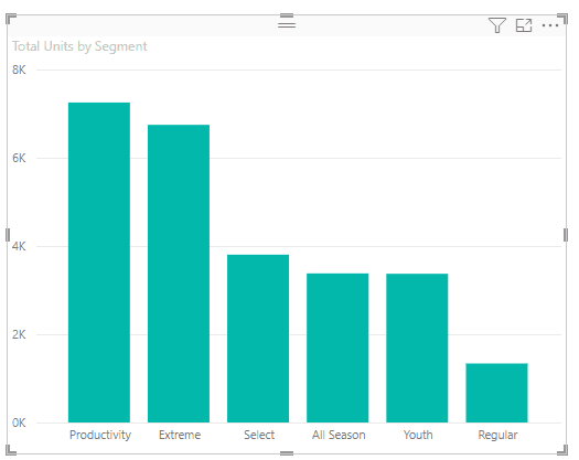
We want to group the Youth and Regular segments together.
3. Click on Youth, hold down your ctrl key, then click on Regular.
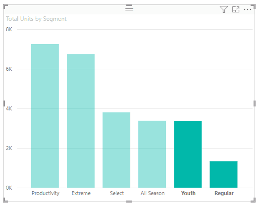
4. Right click on Youth or Regular, and choose Group data.

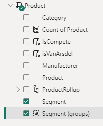
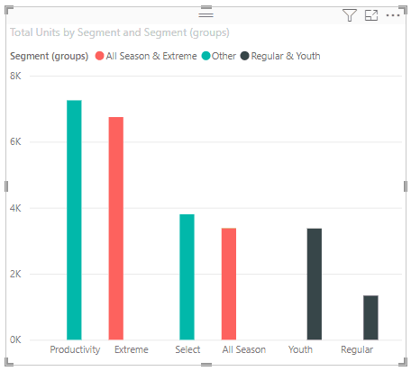
You’ll notice in your legend it says Segment (groups). This is because in your Data pane it has created a group with those two segments in it called Segment (group).

Go ahead and group together Extreme and All Season
Binning
Grouping is typically performed on data fields. Binning is performed on numeric fields.
Create a new page by clicking the + sign next to the pages, and rename it Binning by double clicking on it.
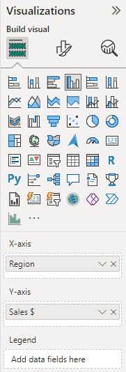
1. Select the Clustered Column Chart visualization
2. In your Data pane under Geo, tick Region
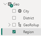
3. Also in your Data pane under SalesFact, tick Sales $


We now want to create bins for years.
4. Expand the Dates table, right click on Year, and choose new group

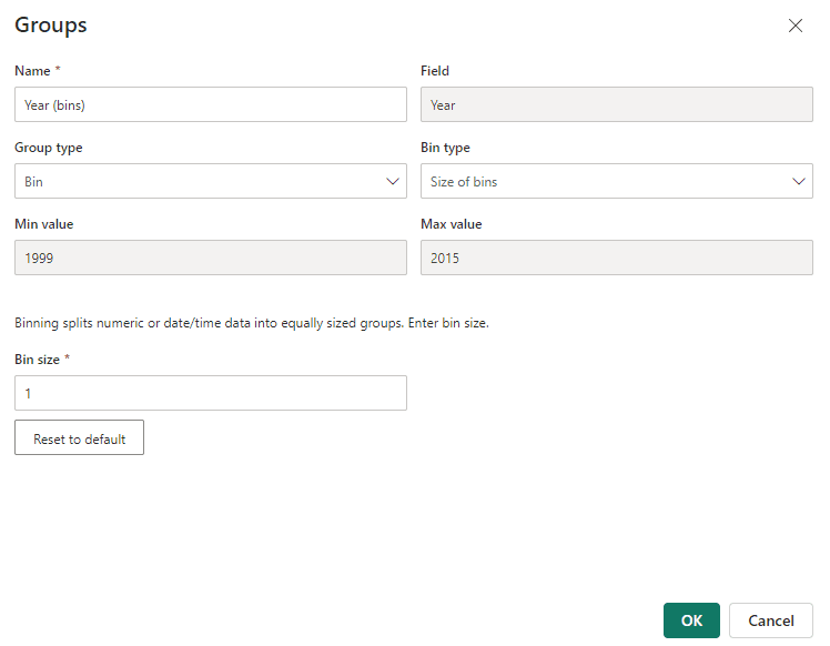
Binning is sort of like grouping a certain amount of Year fields together in one group.
5. Change Bin size to 5, which represents about 5 years, then click OK.

You’ll notice you now have Year (bins) in your Date table
6. Select your visualization, then drag and drop Year (bins) to the Legend box under Visualizations

Each bin consists of 5 years.
Drill Down/Up
In order for you to Drill down/up on a visualization, the visualization must contain a hierarchy.
The first thing we’ll do is create a duplicate of our Binning page.
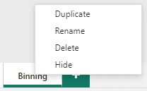
1. Right click on the Binning page and click Duplicate. Rename this duplicate to Drill Down/Up.
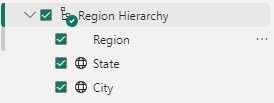
We are now going to create a hierarchy of the Region field. We want it to include the Region and the State.
2. In your Geo table, right click on Region and select Create hierarchy

3. Right click on the State field, choose Add to hierarchy, Region Hierarchy
4. Remove Region from the X-axis box in Visualizations
5. Drag the Region Hierarchy field to the X-axis box
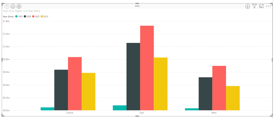
We now need to enable the Drill down feature.
6. In the top right corner of your visualization, click the down arrow
In the top left corner you will see three more buttons. The up arrow represents Drill up, the two arrows represent Drill down, and the last button combines everything in our hierarchy.
7. Click the drill down arrows.

State is the next level in our hierarchy, and we are now at the lowest level of the data (as we only have two things in our hierarchy).
8. Click the up arrow to drill up back to Region.
9. Click the third button to see the combination of Region and State
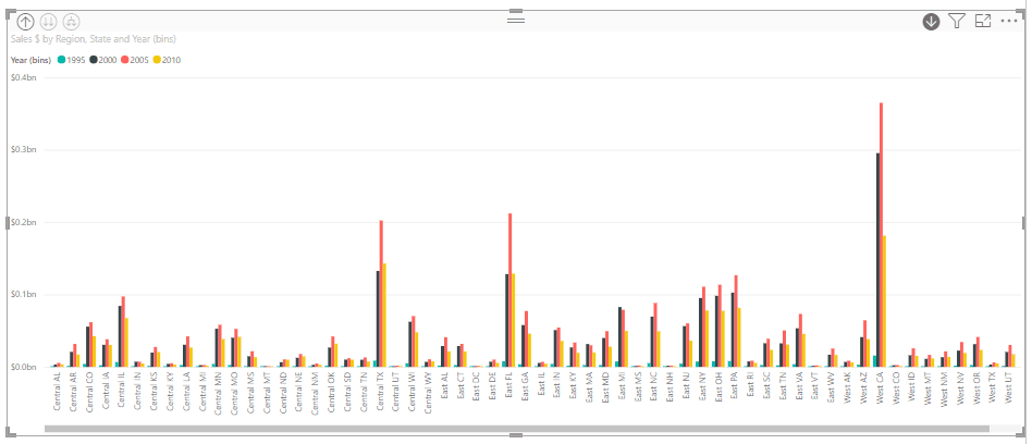
At this point we decide we want City to be in our hierarchy as well.
10. In the Data pane, under the Geo table, right click City, Add to hierarchy, Region Hierarchy.
11. Tick City under the hierarchy
12. In your visualization click the third button twice to see groupings of Region, State, and City

Analyze
Analyze is on every single report page in Power BI desktop. To use this feature, we will continue on the Drill Down/Up page.
Select your visualization, right click inside, hover over Analyze, then click on Find where this distribution is different.
Here, Power BI looks at all the data and gives you sections of analysis. You’re essentially asking it to conduct a comparative analysis to identify where the distribution of data in your selected visualization differs significantly from other categories within your dataset.

Let's say we want to keep a section. The upper right hand corner shows a + button.
Click this + button to add it to the page.
AI Visuals
Key Influencers
1. Create a new page called Key Influencers
2. Add the Key Influencers plot to the page
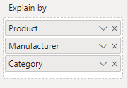
3. Under the SalesFact table, drag and drop Sum of Revenue field to the Analyze box in the Visualizations pane
4. Under the Product table, drag and drop Product, Manufacturer, and Category into the Explain by box in Visualizations
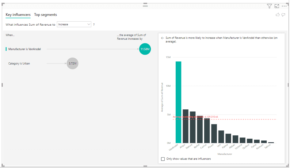
Right now, we’re looking at what influences the Sum of Revenue to increase. The influences are when the Manufacturer is one called VanArsdel, and when the Category is Urban. It shows you how much the average Sum of Revenue increases by.
On the right side we see a chart that tells us the Sum of Revenue is more likely to increase when the Manufacturer is VanArsdel than otherwise (on average). The average value is the red dashed line.
You can hover over the amount bubbles to see more information on the influencer.
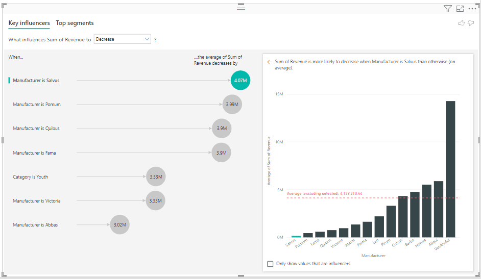
You can also change ‘What influences Sum of Revenue to increase’ to decrease.
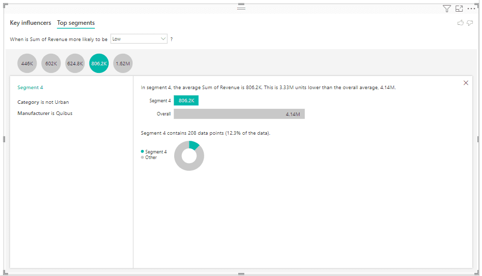
5. Change to the Top segments tab

Select a segment to see more details.
Animated Scatter Chart
1. Create a new page called Scatter Chart
2. Click on the scatter chart visualization to add it to the canvas
3. In tables, drag and drop fields to the boxes in Visualizations. From the Product table, move Category to the Value box, and Segment (groups) to the Legend box. From the SalesFact table move Total Units YTD to the X-Axis box, and Total Units to the Size box. Finally from the Date table, put the Year field into the Play Axis box
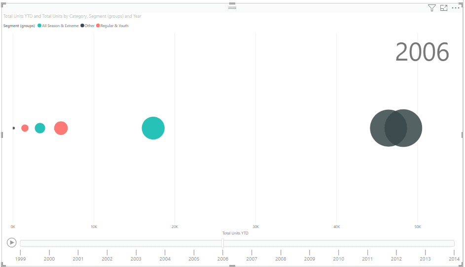
Notice that there is a play button with Year on the Play axis. The scatter chart animates based on the year.
Visual for forecasting values
1. Create a new page called Forecast
Currently in Power BI, the only built in visual that allows for forecasting is the line chart.
2. Find and select the line chart
3. Add YQMD (date hierarchy) from the Date table to the X-Axis box in the Visualizations pane
4. Add Sales $ from the SalesFact table to the Y-Axis box
5. Click on the Analytics button under Visualizations
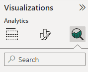
6. Toggle Forecast to On
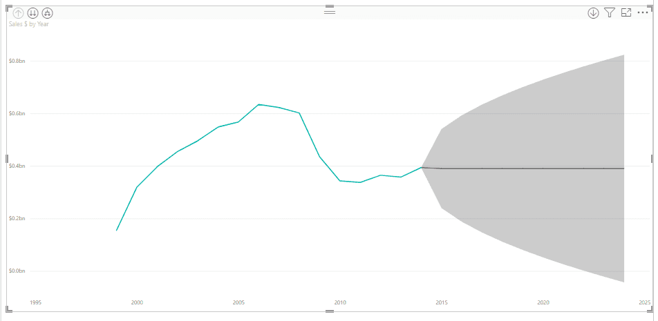
There are defaults that are already filled out (the gray shaded area).
Expand the Forecast box.

7. Change the Units from Points to Year(s).
We now want to tell it to give us our forecast but ignore the last two years.
8. Change the value in Ignore the last from 0 to 2
We told it to ignore the last two years, that’s why you can see the green line (actual data) extending into the shaded area.
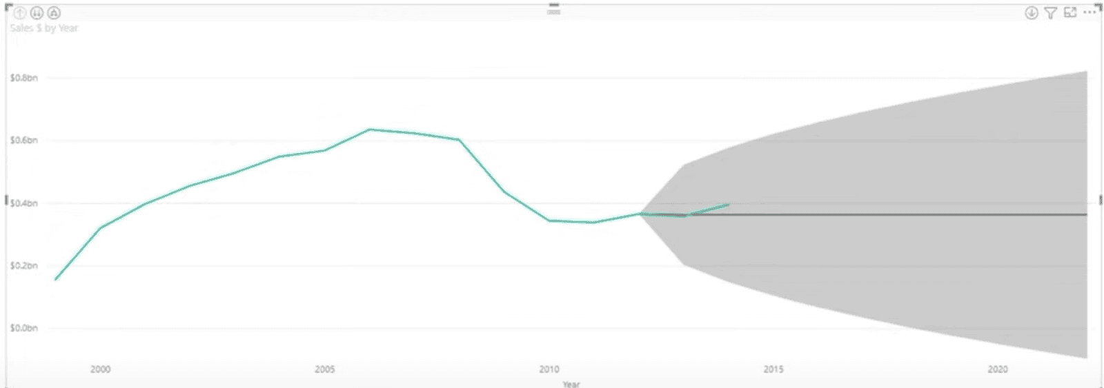
In the Forecast box we also have a confidence interval. This tells you more than the possible range around the estimate, it also tells you how stable the estimate is. I.e., we are 95% confident that the actual data will be somewhere in the gray shaded area.
In the Forecast box we also have a Seasonality option. Seasonality refers to predictable changes that occur over a 1 year period in a business or economy based on the seasons (calendar/commercial seasons). We want it to look within a 5 year cycle of our data.
9. Change the seasonality to 5 points.
The forecast is looking at a 5 year cycle within the dataset.
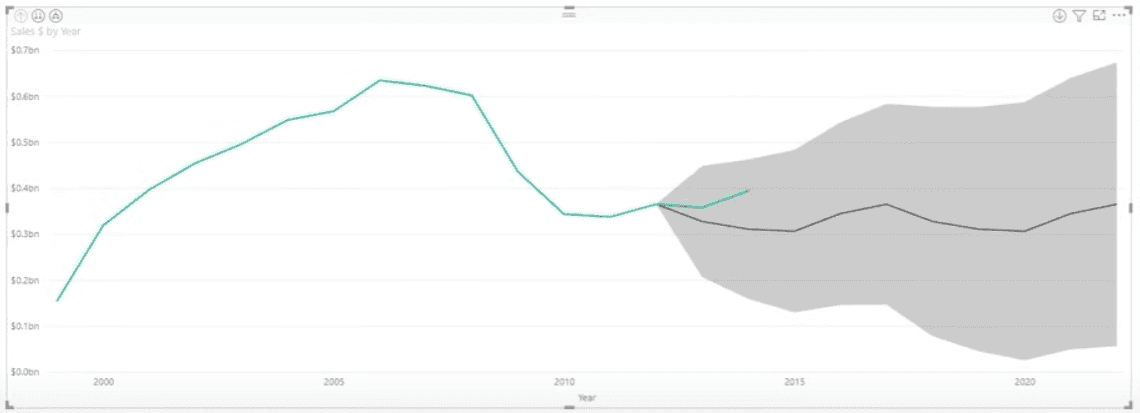
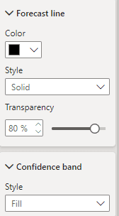
Edit the Forecast line and confidence band just below the Forecast Options box.
Custom Analytics Visual
In addition to the built-in visualizations, you can add custom visualizations in Power BI.
1. Create a new page and call it Violin
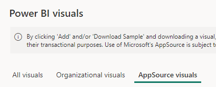
2. Click on the ellipsis under Visualizations and click Get more visuals

3. Make your way to AppSource visuals
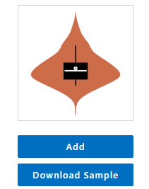
4. In the search box to the right, search ‘violin’, then click on Violin Plot

5. Click Add
In your visualizations pane under all your visualizations, you should now see the icon for the violin plot. Being underneath all the visualizations means that you can use it in this file, but if you close this file and open another instance of Power BI Desktop, it will not be in your Visualizations pane and you will have to add it again. The alternative is to pin it to your Visualizations pane.
6. Right click the violin icon and click Pin to visualizations pane
7. Click the Violin Plot visual to add it to the canvas
8. From the Product table, drag and drop the Segment field to the Sampling box in Visualizations, then drag and drop the Category field to the Category box.
9. From the SalesFact table, drag and drop Sales $ to the Measure Data box
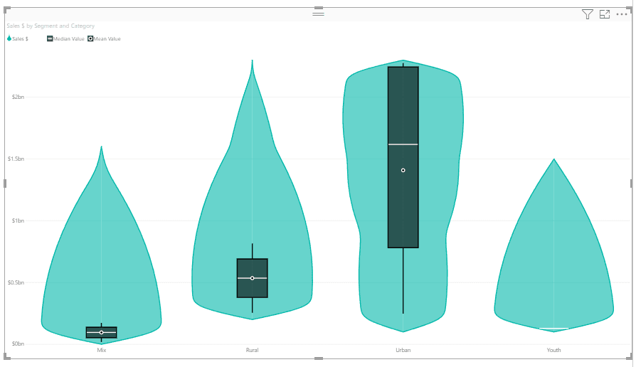
Using the category field gave us multiple violins.
Hovering over a violin gives the Category, # Samples, Maximum, Minimum, Median, Mean, and Standard Deviation.
Introduction
Performing advanced analytics in Power BI offers several benefits that enhance the quality and insights of your reports such as deeper insights, predictive capabilities, and visualization enhancements.
We will start with advanced analytics such as
Grouping
Binning
Drill Down/Up
Analyze
Then, we will move onto AI visuals.
We will be using the .pbix file from the Sales and Marketing sample for Power BI.
Scroll down and download the .pbix file.
Open this .pbix file to launch it on Power BI Desktop.
Grouping
1. Navigate to the Growth Opportunities tab on the bottom
2. Click on the bar chart on the bottom left hand corner to select it
We want to group the Youth and Regular segments together.
3. Click on Youth, hold down your ctrl key, then click on Regular.
4. Right click on Youth or Regular, and choose Group data.
You’ll notice in your legend it says Segment (groups). This is because in your Data pane it has created a group with those two segments in it called Segment (group).
Go ahead and group together Extreme and All Season
Binning
Grouping is typically performed on data fields. Binning is performed on numeric fields.
Create a new page by clicking the + sign next to the pages, and rename it Binning by double clicking on it.
1. Select the Clustered Column Chart visualization
2. In your Data pane under Geo, tick Region
3. Also in your Data pane under SalesFact, tick Sales $
We now want to create bins for years.
4. Expand the Dates table, right click on Year, and choose new group
Binning is sort of like grouping a certain amount of Year fields together in one group.
5. Change Bin size to 5, which represents about 5 years, then click OK.
You’ll notice you now have Year (bins) in your Date table
6. Select your visualization, then drag and drop Year (bins) to the Legend box under Visualizations
Each bin consists of 5 years.
Drill Down/Up
In order for you to Drill down/up on a visualization, the visualization must contain a hierarchy.
The first thing we’ll do is create a duplicate of our Binning page.
1. Right click on the Binning page and click Duplicate. Rename this duplicate to Drill Down/Up.
We are now going to create a hierarchy of the Region field. We want it to include the Region and the State.
2. In your Geo table, right click on Region and select Create hierarchy
3. Right click on the State field, choose Add to hierarchy, Region Hierarchy
4. Remove Region from the X-axis box in Visualizations
5. Drag the Region Hierarchy field to the X-axis box
We now need to enable the Drill down feature.
6. In the top right corner of your visualization, click the down arrow
In the top left corner you will see three more buttons. The up arrow represents Drill up, the two arrows represent Drill down, and the last button combines everything in our hierarchy.
7. Click the drill down arrows.
State is the next level in our hierarchy, and we are now at the lowest level of the data (as we only have two things in our hierarchy).
8. Click the up arrow to drill up back to Region.
9. Click the third button to see the combination of Region and State
At this point we decide we want City to be in our hierarchy as well.
10. In the Data pane, under the Geo table, right click City, Add to hierarchy, Region Hierarchy.
11. Tick City under the hierarchy
12. In your visualization click the third button twice to see groupings of Region, State, and City
Analyze
Analyze is on every single report page in Power BI desktop. To use this feature, we will continue on the Drill Down/Up page.
Select your visualization, right click inside, hover over Analyze, then click on Find where this distribution is different.
Here, Power BI looks at all the data and gives you sections of analysis. You’re essentially asking it to conduct a comparative analysis to identify where the distribution of data in your selected visualization differs significantly from other categories within your dataset.
Let's say we want to keep a section. The upper right hand corner shows a + button.
Click this + button to add it to the page.
AI Visuals
Key Influencers
1. Create a new page called Key Influencers
2. Add the Key Influencers plot to the page
3. Under the SalesFact table, drag and drop Sum of Revenue field to the Analyze box in the Visualizations pane
4. Under the Product table, drag and drop Product, Manufacturer, and Category into the Explain by box in Visualizations
Right now, we’re looking at what influences the Sum of Revenue to increase. The influences are when the Manufacturer is one called VanArsdel, and when the Category is Urban. It shows you how much the average Sum of Revenue increases by.
On the right side we see a chart that tells us the Sum of Revenue is more likely to increase when the Manufacturer is VanArsdel than otherwise (on average). The average value is the red dashed line.
You can hover over the amount bubbles to see more information on the influencer.
You can also change ‘What influences Sum of Revenue to increase’ to decrease.
5. Change to the Top segments tab
Select a segment to see more details.
Animated Scatter Chart
1. Create a new page called Scatter Chart
2. Click on the scatter chart visualization to add it to the canvas
3. In tables, drag and drop fields to the boxes in Visualizations. From the Product table, move Category to the Value box, and Segment (groups) to the Legend box. From the SalesFact table move Total Units YTD to the X-Axis box, and Total Units to the Size box. Finally from the Date table, put the Year field into the Play Axis box
Notice that there is a play button with Year on the Play axis. The scatter chart animates based on the year.
Visual for forecasting values
1. Create a new page called Forecast
Currently in Power BI, the only built in visual that allows for forecasting is the line chart.
2. Find and select the line chart
3. Add YQMD (date hierarchy) from the Date table to the X-Axis box in the Visualizations pane
4. Add Sales $ from the SalesFact table to the Y-Axis box
5. Click on the Analytics button under Visualizations
6. Toggle Forecast to On
There are defaults that are already filled out (the gray shaded area).
Expand the Forecast box.
7. Change the Units from Points to Year(s).
We now want to tell it to give us our forecast but ignore the last two years.
8. Change the value in Ignore the last from 0 to 2
We told it to ignore the last two years, that’s why you can see the green line (actual data) extending into the shaded area.
In the Forecast box we also have a confidence interval. This tells you more than the possible range around the estimate, it also tells you how stable the estimate is. I.e., we are 95% confident that the actual data will be somewhere in the gray shaded area.
In the Forecast box we also have a Seasonality option. Seasonality refers to predictable changes that occur over a 1 year period in a business or economy based on the seasons (calendar/commercial seasons). We want it to look within a 5 year cycle of our data.
9. Change the seasonality to 5 points.
The forecast is looking at a 5 year cycle within the dataset.
Edit the Forecast line and confidence band just below the Forecast Options box.
Custom Analytics Visual
In addition to the built-in visualizations, you can add custom visualizations in Power BI.
1. Create a new page and call it Violin
2. Click on the ellipsis under Visualizations and click Get more visuals
3. Make your way to AppSource visuals
4. In the search box to the right, search ‘violin’, then click on Violin Plot
5. Click Add
In your visualizations pane under all your visualizations, you should now see the icon for the violin plot. Being underneath all the visualizations means that you can use it in this file, but if you close this file and open another instance of Power BI Desktop, it will not be in your Visualizations pane and you will have to add it again. The alternative is to pin it to your Visualizations pane.
6. Right click the violin icon and click Pin to visualizations pane
7. Click the Violin Plot visual to add it to the canvas
8. From the Product table, drag and drop the Segment field to the Sampling box in Visualizations, then drag and drop the Category field to the Category box.
9. From the SalesFact table, drag and drop Sales $ to the Measure Data box
Using the category field gave us multiple violins.
Hovering over a violin gives the Category, # Samples, Maximum, Minimum, Median, Mean, and Standard Deviation.
CONTENT
SHARE