CONTENT
Designing dashboards in Power BI
Designing wireframes for your first dashboard sounds daunting, and often our clients feel intimidated by this process. In the below guide, we aim to tackle some of the barriers in terms of product knowledge and understanding some of the basics when designing a dashboard. Below are the 5 things you need to know to create an effective dashboard

Jackie Tejwani
Director - Business Intelligence
Designing dashboards in Power BI
Designing wireframes for your first dashboard sounds daunting, and often our clients feel intimidated by this process. In the below guide, we aim to tackle some of the barriers in terms of product knowledge and understanding some of the basics when designing a dashboard. Below are the 5 things you need to know to create an effective dashboard.
#1 Start with an overview page
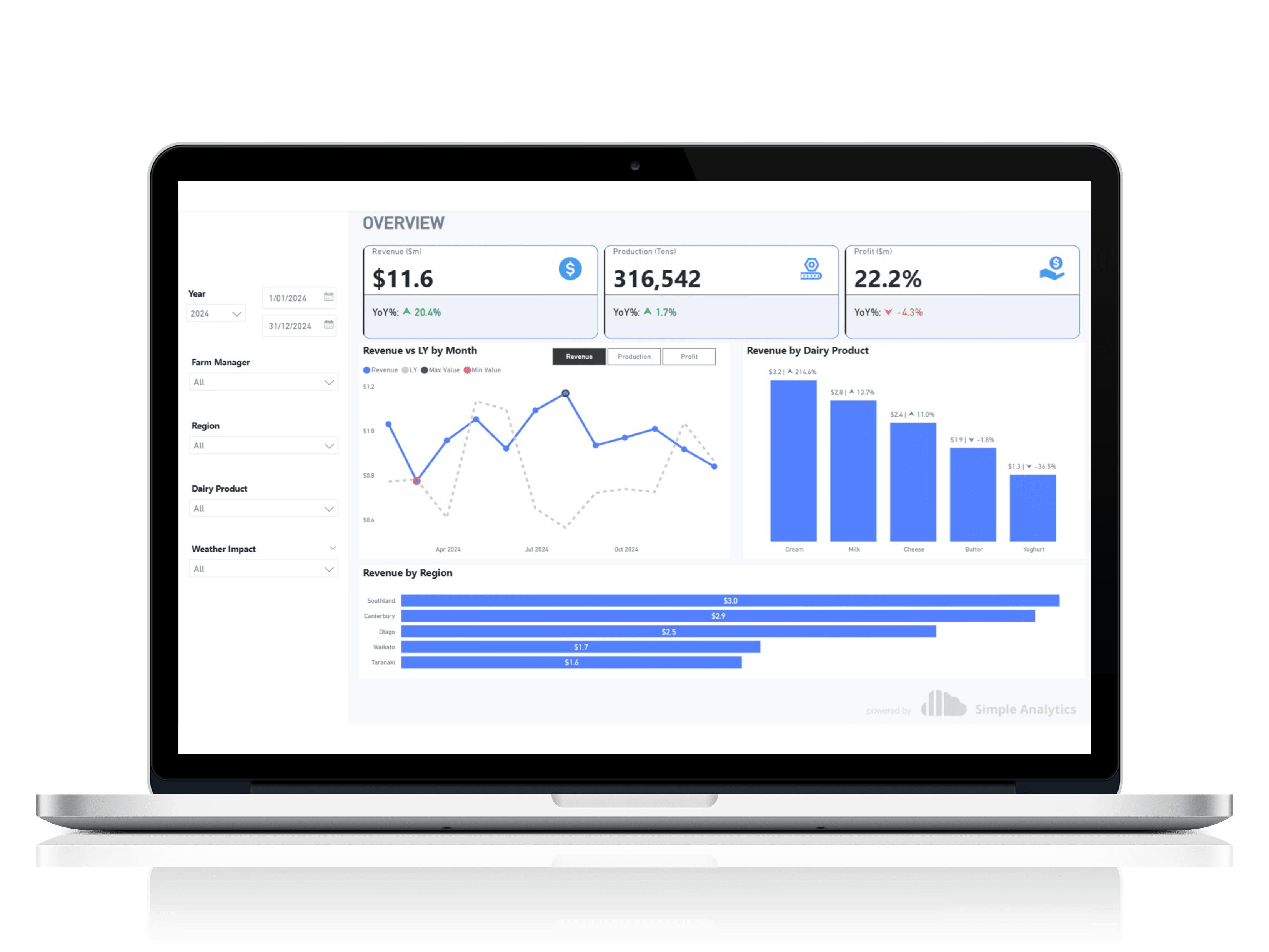
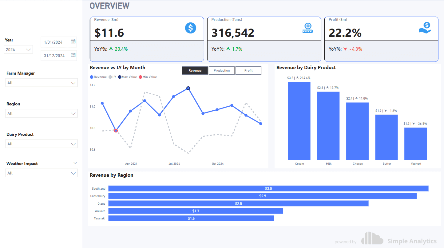
The overview page is undoubtedly the most common landing page for any dashboard. This introduces the user to the data source i.e. Xero, CRM, etc. It builds the tone of the dashboard and allows the report to transition to detailed insights
#2 KPI Metrics
KPI metrics are an essential part of any dashboard, and provide a high-level summary of the numbers plus some comparative metrics such as vs Last Year, vs Budget, without over-crowding the report. The rule of thumb is to stick to 3 to 4 metrics. The exception to this rule is Executive dashboards, as they often only contain high-level KPI Cards.

#2 YoY Trends
Year-on-Year trends are a crowd favourite and provide an easy comparative metric. It is crucial for any operation to understand its performance compared to last year.
For more information on YoY Trends in Power BI, visit https://simpleanalytics.co.nz/blogs/year-on-year-(yoy)-comparisons-in-power-bi

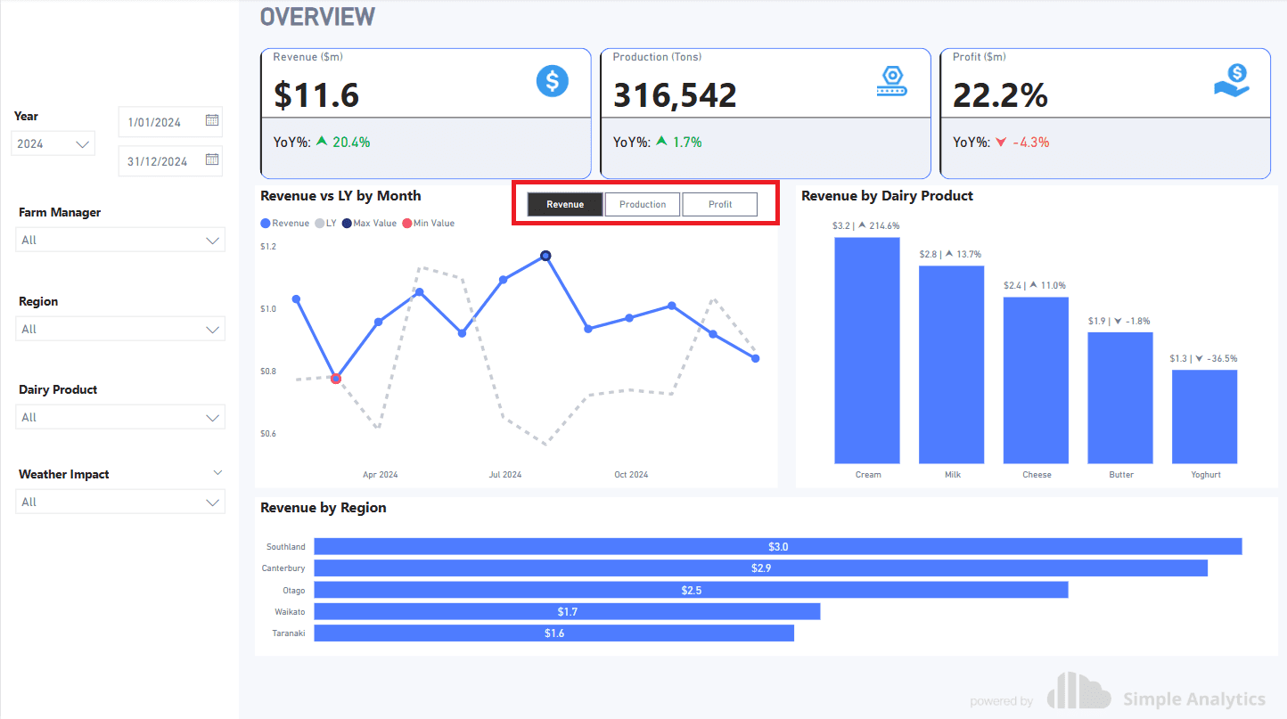
#3 Measure toggle buttons
Toggle buttons, also known as field parameters, are an interactive feature of Power BI and enable report users to toggle through different metrics within the same page.
To set up Field Parameters, check out our previous blog
https://simpleanalytics.co.nz/blogs/field-parameters-in-power-bi-a-comprehensive-guide
#4 Supporting Information
Once the foundations of the overview page have been set up, it is common to require analysis, usually by product, account manager, or region.

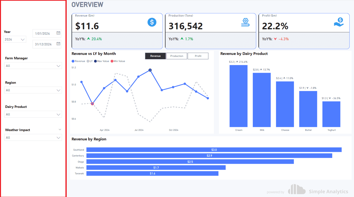
#5 Slicers
Another Power BI feature, the ability to slice and dice information within the report, is what makes Power BI so impressive. The filter pane usually sits well on the left for easy navigation.
Designing dashboards in Power BI
Designing wireframes for your first dashboard sounds daunting, and often our clients feel intimidated by this process. In the below guide, we aim to tackle some of the barriers in terms of product knowledge and understanding some of the basics when designing a dashboard. Below are the 5 things you need to know to create an effective dashboard.
#1 Start with an overview page
The overview page is undoubtedly the most common landing page for any dashboard. This introduces the user to the data source i.e. Xero, CRM, etc. It builds the tone of the dashboard and allows the report to transition to detailed insights
#2 KPI Metrics
KPI metrics are an essential part of any dashboard, and provide a high-level summary of the numbers plus some comparative metrics such as vs Last Year, vs Budget, without over-crowding the report. The rule of thumb is to stick to 3 to 4 metrics. The exception to this rule is Executive dashboards, as they often only contain high-level KPI Cards.
#2 YoY Trends
Year-on-Year trends are a crowd favourite and provide an easy comparative metric. It is crucial for any operation to understand its performance compared to last year.
For more information on YoY Trends in Power BI, visit https://simpleanalytics.co.nz/blogs/year-on-year-(yoy)-comparisons-in-power-bi
#3 Measure toggle buttons
Toggle buttons, also known as field parameters, are an interactive feature of Power BI and enable report users to toggle through different metrics within the same page.
To set up Field Parameters, check out our previous blog
https://simpleanalytics.co.nz/blogs/field-parameters-in-power-bi-a-comprehensive-guide
#4 Supporting Information
Once the foundations of the overview page have been set up, it is common to require analysis, usually by product, account manager, or region.
#5 Slicers
Another Power BI feature, the ability to slice and dice information within the report, is what makes Power BI so impressive. The filter pane usually sits well on the left for easy navigation.
CONTENT
SHARE